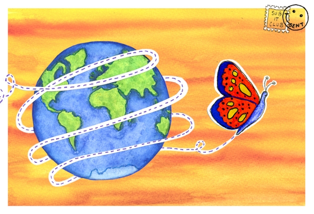
The Postcard Post
by Dana Carey
Sub It Club will feature an illustrator and postcards each month. Scroll down to see each month’s offerings! But first, an overview on illustrator self-promotional mailings.
For illustrators, there are different approaches to submitting work. The postcard is a relatively cheap promotional tool to get your work seen far and wide. It can show what you do, provide your contact info and point art directors and editors to an online portfolio. Your postcard should be excellent work presented in a professional fashion. This is your foot in the door so make sure you put your best foot forward.
- Postcard mailings can get your work seen across the globe

Use the most successful piece from your portfolio or create a new piece, perhaps a series. Send out postcards in a style you’re proficient in and of things you like to draw. If you love drawing dragons, put a dragon on there. If you hate drawing people, don’t send images with lots of people. You just might get a job! Make sure you’ll bring in work you’re interested in doing. And your credibility is at stake if you can’t follow through.
If you’re interested in illustrating children’s books, show off your storytelling skills with a strong narrative. If you’re looking for other kinds of editorial work, highlighting your style or your mastery of a technique might be the key to catching the art director’s attention.
Most art directors and editors keep files of postcards. An art director at a SCBWI conference said she loved it when illustrators sent her a postcard every three months or so. She particularly loved series of postcards and looked forward to each new installment. She tacked up postcards that she liked on her office wall.
Although some illustrators might not like cluttering up their illustration with type on the front of the postcard, there is a good reason to do this. The viewer will identify your work with your name instantly. If you think this could work for your postcard, keep text to a minimum and integrate it in a clever, visually pleasing way.
Don’t forget about the back of the postcard! It can complement the front: use it to your advantage. Include all your contact information: name, website (online portfolio), address, email address, phone number, blog, facebook page… whatever information you feel comfortable putting out in the world. Also, black and white spot art could complement the art on the front and show the art director another skill.
There are lots of companies online who will print your postcards. 4by6.com; Modern Postcard; Overnight Prints, moo… They all have specifications (templates, sizes, file formats) that you need to follow. Read carefully so you get the best result for your money.
Mail them out. Keep track of where, when and to whom you send. Hand them out at conferences. Have them on you at all times– you never know when you’ll run into someone who might be interested in your work. Use them as leave-behinds. Keep a bunch in your portfolio. Bottom-line, you want art directors and editors to contact you, to look further into your work through this introduction in the form of a postcard.
___________________________________________________________________
The March Postcard Post: Nina Victor Crittenden
Today is the first installment of a new feature for Sub It Club that I’m very excited about. Each month we’ll spotlight an illustrator and her/his postcards. Get ready to sample some great artwork and to get the scoop on its creation. This month, Sub It Club is thrilled to welcome illustrator, Nina Victor Crittenden.
Nina is a proud Minnesotan, a mother of two, and is terrible at writing bios*. Her first book, Cedric and the Dragon, was published in 2010. She is currently illustrating a series of piano music books for kids and working on a picture book dummy of her own.
*I didn’t say that!

How do you choose the image(s) for a postcard?
Most of the time, I’ll just have an idea and run with it. My last mailer started when “The Humpback of Notre Dame” popped into my head. It ended up turning into a large illustration of punny sea creatures, an old-timey nautical map for the back of the postcard, and a set of Go Fish cards.
-
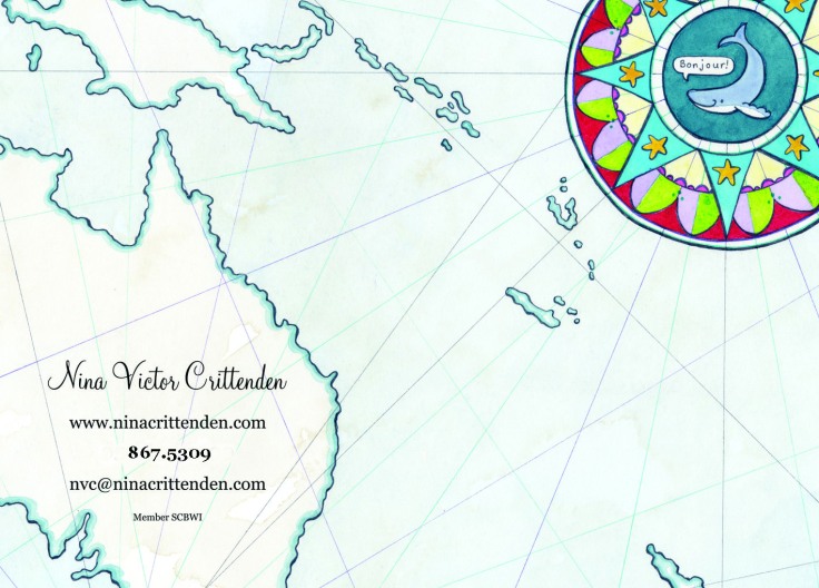
Back (Sacré Bleu! That whale speaks French!)

Do you prefer text on the front of the postcard with the image or do you prefer all text on the back of the postcard?
The back of my postcard has all of my info on it, but I make sure to put my name and web address on the front of the card, too, because I read it somewhere and it sounded like a solid idea.
Do you create illustrations specifically for your self-promotion pieces?
Good question, never thought about it… but I think that I usually do. 🙂
Some illustrators do a series of postcards and send them out over time. Do you create a series or stand-alone images? So far, my postcards have all been stand-alone images. My next idea for a card involves some sequential art, so that will be a fun one to make.
How often do you send out postcards?
Last year I sent out three postcards, I need to get cracking on a new one. Can’t believe it is already mid-March*!
*Me neither! Eek!
Who do you target with your mailings?
I send my postcards primarily to art directors at children’s publishing houses and magazines where I feel that (and hope that) my style might be a good fit.
Do you have any tips on the production process?
I work traditionally in ink and watercolor, scan my work in at home, and clean it up in Photoshop (for larger pieces of work, I scan them in pieces and then use Automate -> Photomerge to stitch them together), and make sure the image fits the specs required for printing. I have two favorite fonts and use them on everything, so I am always presenting myself in a consistent manner.
Do you use any online services? What are your favorite places to get postcards printed?
I have had really great luck with GotPrint.com. Their prices are outstanding and the print quality is excellent.
-
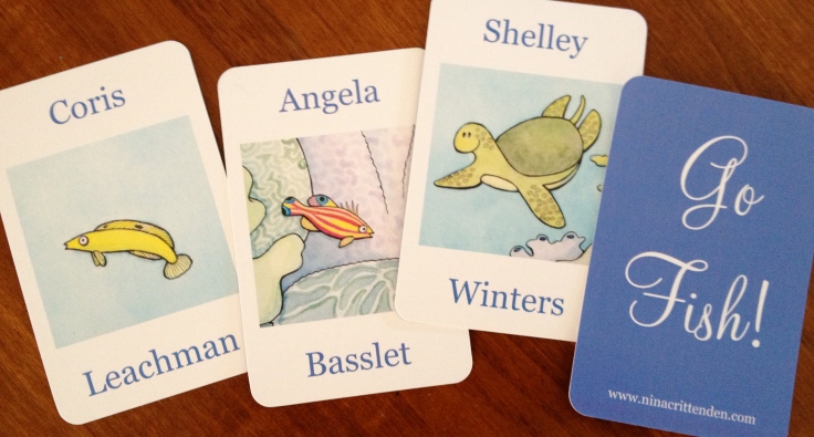
I love these Go Fish! Cards. Very punny idea!

Thanks so much, Nina, for taking the time to show us your beautiful postcard (and Go Fish! Cards) and for sharing your experience.
You may already know Nina online but if you don’t, I highly recommend that you follow the links and get to know Nina and her work. She’s talented and fun!
http://ninacrittenden.blogspot.com
twitter: @NVCrittenden
Check out Nina’s book here: Cedric and the Dragon (ISBN: 978-1-934617-05-2)
__________________________________________________________________
The April Postcard Post: Rachelle Meyer
This month’s featured illustrator is Rachelle Meyer who I’ve run into many times online but never in person. Maybe one of these days we’ll go from flat screen to those lovely three dimensions but in the meantime, I’m happy to have her here at the Sub It Club. Without further ado, meet Rachelle…
Rachelle Meyer was born in the state of Texas and spent most of her childhood with her nose in a book. Reading became the wellspring for her continuing passions in life: drawing, storytelling and traveling. She graduated with a degree in Studio Art from the University of Texas at Austin and then spent eight years in New York City working as a graphic artist and designer. She has since moved to Europe and launched a successful career as an illustrator, working on books for children of all ages in both English and Dutch. She also writes and illustrates her own picture books and graphic novels. She now lives in Amsterdam with her English husband, her Dutch son, and her cranky old New York cat.
-
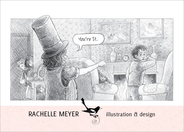
Front (Who IS that top-hatted person? I want to know!)

How do you choose the image(s) for a postcard?
I take a look at what I’ve done since I last printed a postcard and try to find the strongest image. I also run my top picks by my crit group for feedback, which is immensely helpful. I reprint them at the size I intend to use for postcards, line them up on the dining room table and see which one yells out at me.* Finally, because I’m awfully wishy-washy about picking things, I try and think about who I want to be and how I want to grow. Something rises to the surface.
Both front and back are integrated into a new house-style I’m creating for myself that includes the use of pink paper textures and black and white vector images of birds that I made for a mobile for my son when he was born three years ago. I am repurposing them to the hilt!
*Got to love a postcard that yells! Now if we could get them to murmur in the ears of art directors…
-
Back (I get the feeling we’ve got ourselves a bird lover here.)

Do you prefer text on the front of the postcard with the image or do you prefer all text on the back of the postcard?
Usually I prefer a full bleed image on the front with minimal text (just my name and esteemed title as Illustrator), but I had an image with odd dimensions this time so I got funky with it.
Do you create illustrations specifically for your self-promotion pieces?
Oh, that’s a very good question. Until recently, I was only using commissioned images because I still felt like I needed to prove myself as an illustrator. “See! People pay me to do this stuff! For real!” But I’ve come to realize the illustrations I do for my own projects often pop out more. I tend to nurture them longer and they also have some ineffable quality in them that I can only describe as ME. The current one is from a graphic novel I’m developing.
Some illustrators do series of postcards and send them out over time. Do you do series or stand-alone images?
I’ve never done a series, but it sounds like fun.
How often do you send out postcards?
Blerg.* I have been incredibly remiss in this area for the past three years. I’ve printed a few but never sent them out en masse. Then I got a book assignment last summer from a postcard I sent out in 2009 and realized I need to get back on the horse!*
*I’ll see your blerg and raise it.
*Saddle up with the Sub It Club!
-
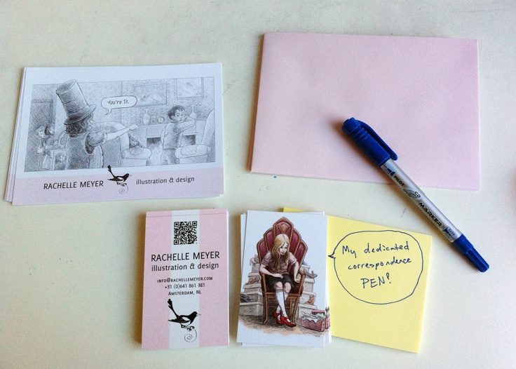
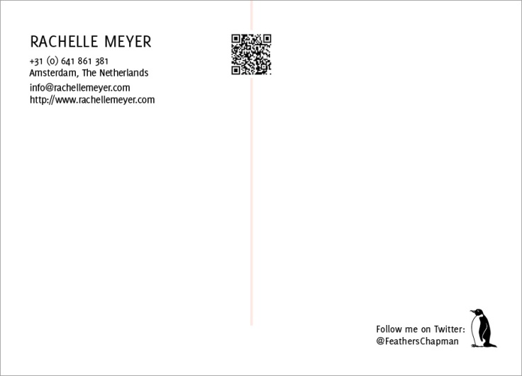
What a package: organization and talent! A QR code AND a pen just for postcards!

Who do you target with your mailings?
The current card I’m using is kind of all-purpose and I’m sending it out bit by bit to my full list. I have a weekly goal of sending out five per week while I’m still very busy with assignments. Since I’m targeting my “top picks” right now I’m sending these little packets out with my business card and matching pink envelopes. I started with the UK but just sent out a few to Dutch publishers this week because I had more local stamps on hand.
Do you have any tips on the production process?
I set them up in InDesign and stick to my current house-style. I wish I had adjusted the contrast on my illustration a little more for this one but oh well.
Do you use any online services? What are your favorite places to get postcards printed?
I’ve been using a local online service called drukland.nl and they’ve been fine. I may look for a printer with proofing services again for next time because I think I should use a color image again and I get very persnickety about how that translates to print.
Thanks for the interview! It was lots of fun.
Thank you, Rachelle. It was great having you here. I loved learning about your process and picked up a few tips.
Get to know more about Rachelle and her work at these links:
Portfolio: http://www.rachellemeyer.com
Blog: http://rachellemeyer.tumblr.com/
Twitter: @FeathersChapman
Flickr: http://www.flickr.com/photos/featherschapman
Facebook: http://www.facebook.com/rachelle.meyer.7
___________________________________________________________________
The May Postcard Post: Jennifer Thermes
The Sub It Club is very happy to have Jennifer Thermes share tips and her latest work with us. When Jennifer showed this month’s featured postcard in a step-by-step progression on her blog, I knew she’d have to pay us a visit. I’ll give you a link to that post but only after you read the interview! So, without further ado…
Jennifer Thermes is a children’s book author and illustrator. Her recent books include THE ICIEST, DICIEST, SCARIEST SLED RIDE EVER! by Rebecca Rule, which received a starred review from Kirkus, and MAGGIE & OLIVER, a middle-grade novel by Valerie Hobbs, which was named a Bank Street College Best Children’s Book. Jennifer has books forthcoming in Fall ’13 and Spring ’14 with Albert Whitman & Co., Islandport Press, and Sleeping Bear Press. Her work has been described as “reminiscent of Lois Lenski” by The Horn Book Magazine.

How do you choose the image(s) for a postcard?
First it’s a matter of whether I want to do a color or a black & white card, which depends on what kind of assignments I’m going after. Then I try to come up with an image that grabs the viewer’s attention. I like to create a sense of movement in my art, so I design my illustrations with that in mind. Other than that it’s really a matter of gut instinct— what am I feeling most excited about at the moment!

Do you prefer text on the front of the postcard with the image or do you prefer all text on the back of the postcard?
I like text on the front to be minimal, just name and website, on the theory that if an editor or art director pins the card on their board it’s easier for them to keep my name in mind.* All the rest of the information goes on the back.
* Excellent point.

Do you create illustrations specifically for your self-promotion pieces?
Yes, usually, because I don’t always have an image that would be appropriate for a card and fits the size format. Also, it’s a good idea to send something that you really love to do, since that’s the kind of work you’re trying to attract.
Some illustrators do series of postcards and send them out over time. Do you do series or stand-alone images?
I’ve thought about creating a series, but that idea always manages to bump up against a deadline, so it’s been stand-alone images. Also, I’m not sure a series would make sense to an art director if you were only sending cards a few times a year. Unless, of course, they loved and kept every one! But that said, it’s still on my “to-try” list.
How often do you send out postcards?
Roughly four times a year, give or take a few months.
Who do you target with your mailings?
I send cards to art directors and editors in children’s publishing. Often editors are the ones who choose an artist, so it’s good to target both. *
* Great tip–take note, everyone.
Do you have any tips on the production process?
I have a template file set up in Photoshop with information all ready to go, though I do tweak the colors and design from time to time. It’s pretty simple, since the focus should be on the art. Since I work traditionally in pencil and watercolor, I scan my art once it’s done, and drop it into the template. Voilà!*
* I knew some French would slip in eventually.
Do you use any online services? What are your favorite places to get postcards printed?
I’ve been using gotprint.net for a few years now and have usually had good results. Their prices are reasonable, too.
Thank you for inviting me to share, Dana. This was fun!*
* It’s been a thrill for me to have you here, Jen. Your work is beautiful and you’ve given us all some great information.
Don’t let the fun and feasting-of-the-eyes end here: the promised link to Jennifer’s work-in-progress: http://art-words-life.blogspot.fr/2013/04/black-and-white-step-by-step.html
And there’s more. Click away!
Website: http://www.jenniferthermes.com
Blog: http://art-words-life.blogspot.com
Twitter: http://twitter.com/jenthermes
Facebook: http://www.facebook.com/JenniferThermesIllustration
______________________________________________________________________
The June Postcard Post: Elizabeth Rose Stanton
The Sub It Club is thrilled to feature the work of Elizabeth Rose Stanton this month. I first came across Elizabeth’s work on Facebook where she treats everyone to gorgeous daily sketches. I’m looking forward to seeing what Elizabeth has in store for us today so, take it away, Elizabeth!
Elizabeth Rose Stanton studied art history in college and went on to earn a graduate degree in architecture at Columbia University. After working as an architect and designer, she stepped away from a professional career to raise her family. Since then, she has worked as a portrait and fine artist, designer, and scientific illustrator. She now devotes herself full time to writing and illustrating picture books for children. She lives in Seattle with her husband, two cats, and a one-eyed dog.
Elizabeth is a member of SCBWI International and SCBWI Western Washington. She is represented by Joanna Volpe of New Leaf Literary & Media in New York. Her debut picture book, HENNY (Simon & Schuster/Paula Wiseman Books), will be released in January, 2014.

How do you choose the image(s) for a postcard?
I try and keep it simple. My stories are very character-driven, so I like to use a single character or a small group of characters. I like clean, uncomplicated images.
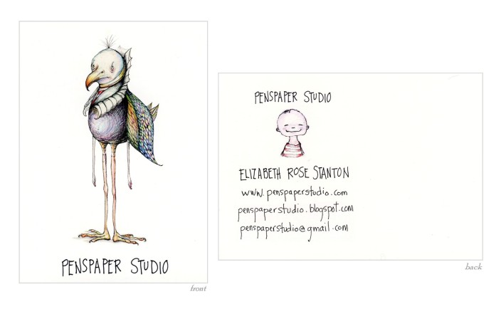
- That bird seems to have something on his mind. I bet he could tell us a story or two!

Do you prefer text on the front of the postcard with the image or do you prefer all text on the back of the postcard?
I prefer to place most of the text on the back of the postcard. The larger image on the front “grabs” attention so that people will want to turn it over to find out more. I also think it’s helpful to put smaller image on the back along with the contact info—just as another little “teaser.”*
*Consider me teased! I must see more.
Do you create illustrations specifically for your self-promotion pieces?
I haven’t so far. I usually just choose from what I am currently working on.
Some illustrators create a series of postcards and send them out over time. Do you a do series or stand-alone images?
I’ve only used independent images. But I am certainly open to doing a series in the future. I think both can be beneficial, depending on what you want to get across. Again, since my stories tend to focus on one particular character, I think the “stand alone” is more indicative of the kind of work I do.
How often do you send out postcards?
Actually, up until now I have used postcards almost exclusively for conferences and as “business cards.” Early in 2012 I was all set to do a postcard mailing when I was contacted by my now-agent, Joanna Volpe (she picked up my postcard 🙂 at the SCBWI NY 2012 conference portfolio show).* I signed on with her and, a short time later, got the contract for my book, HENNY—so I never got around to the mailing. That said, Joanna and I recently talked about sending out a batch. Since I have been focusing on farm animals lately, and my book is about a chicken, she suggested using one of my more “quirky” images for this new card to show another “side” of my work, so to speak.
*Take note: postcards can do double-duty as business cards and great things can happen at SCBWI conferences.

Who do you target with your mailings?
For this upcoming mailing, I believe we will be targeting children’s editors and art directors.
Do you have any tips on the production process? Do you use any online services?
I usually use Adobe Illustrator for font and layout, then follow the file sizing guidelines for wherever it is I am getting them produced. I did use hand lettering for the set of postcards I did for my first NY conference, and I had them printed at Moo moo.com. Moo will print batches of multiple images, which is especially useful if you want to show more than one image or you just can’t make up your mind. This is the postcard that caught my agent’s eye at the conference:

What are your favorite places to get postcards printed?
For my most recent postcard (the one I used for the 2013 NY conference), I found a small local printer here in Seattle www.princetonpress.com. I liked using them because I could actually talk to someone about placement and color, and I got to pick the kind of paper stock and card size I wanted. The turn-around time was short, too, which was very helpful at the time. It also felt good to be patronizing a local small business.*
*It is nice to talk to real people sometimes.

I am flattered to have been invited to share my postcards with you, Dana. I love the lively wealth of information and inspiration here on Sub It Club! Thank you!
Thank you so much for stopping by, Elizabeth. Your work is wonderful and you’ve shared a lot of very helpful information for illustrators.
Click on these links to see more of Elizabeth’s work. (Remember — daily sketches on Facebook– what are you waiting for?!)
Website: www.penspaperstudio.com
Blog: penspaperstudio.blogspot.com
Twitter: @penspaperstudio
Facebook: facebook.com/PenspaperStudio
And Elizabeth’s picture book, HENNY:
books.simonandschuster.com/Henny/Elizabeth-Rose-Stanton/9781442484368
_________________________________________________________________
The July Postcard Post: Russ Cox
The Sub It Club welcomes Russ Cox this month. If you haven’t come across Russ’s illustrations before, you’re in for a treat. Let’s find out about Russ and his latest postcard.
RUSS COX was raised by a pack of crazed hillbillies in the backwoods of Tennessee. Without much in the way of modern conveniences, like a television set or running water, he spent his time drawing away the hours. After dismantling his grandfather’s lawn mower engine, and without a clue on how to get it back together, he realized that he did not have an automotive bone in his body so he kept drawing. After graduating from art school, with a portfolio in hand, he ventured into the world of design and illustration. He opened his own studio, Smiling Otis Studio, where he presently specializes in illustration for children. When not drawing, running amok in the snow, or training his four cats to sing Bohemian Rhapsody, Russ enjoys some quiet time, working on his picture book stories. He also enjoys playing the banjo but his wife would prefer him to play the triangle or build a soundproof room.

How do you choose the image(s) for a postcard?
The first thing I make sure is that the image is telling enough of a story that the viewer would like to see more.* I then continue it on the back with a simple black and white illustration. The other thing I look for is making sure the images are strong enough in character development.
*You’ve definitely got me wanting more with this one. I’m closing my eyes until you say that octopus is nice.


Do you prefer text on the front of the postcard with the image or do you prefer all text on the back of the postcard?
I put my name, phone number, and email address on the front so it is easy to contact me without having to take the postcard down if the art director has it hanging up.* The rest of my info goes on the back.
*You’ve done a great job of putting type on the front and making it visible without overwhelming the image at all.

Do you create illustrations specifically for your self-promotion pieces?
I do. I like the idea of showing something fresh and current. Plus a lot of time, I can’t use any images until the book is out which could take a year or more.
Some illustrators create a series of postcards and send them out over time. Do you create a series or stand-alone images?
I do stand-alone postcards. For me it’s about keeping things fresh and new so each card is different. I think it allows you to show how you are developing your style and give the art director or publisher a taste of a new story idea.
How often do you send out postcards?
I try to do 3 mailings a year. Some illustrators do 4 or more but I find it difficult to find the extra time to do that many.*
*3 mailings a year is pretty darn good.
Who do you target with your mailings?
Since I landed an agent this year*, my mailings are now focused on publishers, agents, art directors, etc. I also try to send a postcard to magazines, game companies, and any other client that I find interesting.
*I love how you slipped that in there, Russ–but seriously, that deserves an ALL CAPS shout-out! Congrats on the agent landing!
Do you have any tips on the production process?
I use Photoshop for tweaking my images and use Illustrator for my layouts. I find it easier to manipulate fonts if I need to do so. My images are 300 dpi and saved as eps files that are imported into Illustrator. My postcard printing is done by OvernightPrints so I export the final files as tiffs and then double check the colors in Photoshop.
Do you use any online services? What are your favorite places to get postcards printed?
Again, I use OvernightPrints for my cards and have had great results with them. I know other illustrators who use Vista Prints and Modern Postcards.
Click on the links below to find out more about Russ and his illustration work.
Website: http://www.smilingotis.com
Twitter: https://twitter.com/@smilingotis
Blog: http://smilingotis.blogspot.com
Facebook: http://www.facebook.com/pages/Smiling-Otis-Studio
Tumblr: http://theideanapkin.tumblr.com
This has been so much fun. Thanks for sharing your tips, sketches and beautiful postcard, Russ! And let me know about the octopus– this is hard to do with my eyes closed.
____________________________________________________________________
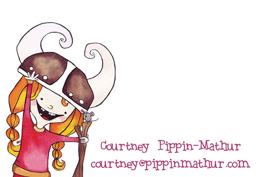
The August Postcard Post: Courtney Pippin-Mathur
The Sub It Club welcomes author/illustrator Courtney Pippin-Mathur to the Postcard Post. Keep reading to learn more about Courtney, her postcard and her picture book.
Courtney discovered her love for drawing by re-creating the characters from her favorite animated movies and cartoons. She forgot how great it was until she switched from a major in Government to a major in Studio Art in college. She hasn’t looked back since.
She draws, paints and plays with pixels on the East Coast with her daughter and twin sons. Her first book, MAYA WAS GRUMPY was released this year.

How do you choose the image(s) for a postcard?
I usually go with whatever piece I have created recently that I’m most excited about. If I’m out on submission or working on something to send out soon, I’ll include the main character in the story.

Do you prefer text on the front of the postcard with the image or do you prefer all text on the back of the postcard?
I always put my name on the front so that it is (hopefully) ingrained in the art director/editor’s mind whenever they look at the image.
-
Postcard back. Full color for great impact!

Do you create illustrations specifically for your self-promotion pieces?
Not usually. Sometimes I will think, “This would look great on a postcard,” and tailor it with that in mind.
Some illustrators create a series of postcards and send them out over time. Do you create a series or stand-alone images?
So far, stand alone. I think series images are super-cool though!
-
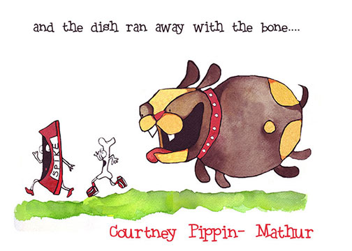
Somehow I don’t think the dish or the bone will get very far. Ruff!

How often do you send out postcards?
I try to remember every 3-4 months but lately it’s been twice a year. It also depends on what my agent wants to do that year.
Who do you target with your mailings?
Art directors and editors in children’s publishing.
Do you have any tips on the production process?
I recently started using Photoshop and I like the flexibility in fonts and tweaking it gives me.
Do you use any online services? What are your favorite places to get postcards printed?
I’ve been using Overnight Prints for a few years now and have been pleased with their speed and quality.
Thanks so much for sharing your tips and beautiful illustrations, Courtney!
More about Courtney is just a click away:
Website: www.pippinmathur.com
Twitter: @pippinmathur
Facebook: https://www.facebook.com/pippinmathurillustration
And Courtney’s picture book, MAYA WAS GRUMPY: http://www.flashlightpress.com/Maya_Was_Grumpy.html
_______________________________________________________________
The September Postcard Post: Hazel Mitchell
Sub It Club is thrilled to welcome Hazel Mitchell to the Postcard Post this month. I had the pleasure of meeting Hazel in person in Paris at the 2013 SCBWI Europolitan Conference where she served on the faculty. I learned a lot at her session on graphic novels. Hazel is a consummate professional so get ready to enjoy some beautiful illustrations and pick up some very helpful tips on producing and sending out your self-promotion postcards.
Hazel Mitchell is an award winning illustrator. From an early age she drew on most everything she could get her hands on and still can’t be left safely alone with a pencil. Her most recent books include ONE WORD PEARL, 1, 2, 3 BY THE SEA, HIDDEN NEW JERSEY, ALL-STAR CHEERLEADERS series by Anastasia Suen and HOW TO TALK TO AN AUTISTIC KID (Foreword Reviews Gold Medal winner and Finalist in ‘Books for a Better Life’). At the moment she’s working on a new book about a Maasai girl for Charlesbridge called IMANI’S MOON for Fall 2014.
Originally from Yorkshire, England, she now lives and works from her studio in Central Maine, USA. She still misses fish and chips and mushy peas, but is learning to love lobster. She has a dog, a cat, two horses and several snow shovels. You can see more of her work at www.hazelmitchell.com or find her on Facebook and all those other online places!

How do you choose the image(s) for a postcard?
Quite often I use an image I have worked on recently. Or from a recently released book. I don’t do ‘themed’ cards, i.e., tie in with a season or a holiday, or a silly day (like donut day)*. I’ve seen some really great postcards that do this though! I sometimes do something different, like send out a black and white image, or several images on the same card. Occasionally I send out an image from personal (not contracted) work in progress.
*Not even donut day? Now I want a donut. And I want Hazel to do a donut postcard.
Do you prefer text on the front of the postcard with the image or do you prefer all text on the back of the postcard?
I’ve done it both ways. I used to just put my website address on the front discreetly, but in my latest mailing I had my name much bigger. And not so discreet!* I always have my details on the back and usually another image (or two) smaller that goes with the front image (might be a sketch for example). But try not to crowd!
*You go, Hazel!

Do you create illustrations specifically for your self-promotion pieces?
Occasionally. I definitely did that more when I wasn’t working on books so much. And then I mailed out cards and I got busier on books, so now I usually put something I am working on, on. When I started out, most of my mailouts were portfolio pieces.
Some illustrators create a series of postcards and send them out over time. Do you create a series or stand-alone images?
Some of my friends have had a lot of success with the ‘overtime’ mailouts. For example, sending out the same characters doing different things on different postcards. But I don’t think I am that organized! Mine are stand alone. But now I am thinking I might try a timed mailout … hmm. Some people do really creative things with their postcards, but it’s usually just a single image for me. KISS*, as they say. Some of my choices for postcards have bombed. You know that when nothing comes back, ever. It’s a good idea to be consistent in your style when you mail out so art directors and editors get to know you. Alas, I fail at this because I work in different styles. But what works for one person, doesn’t work for another. As long as something works, that’s the main thing!
*If, like me, you didn’t know this acronym, I’ll save you the trouble of googling: “Keep it simple, stupid!”
How often do you send out postcards?
I’ve had all kinds of schedules. 3 monthly, 6 monthly, monthly, group postcard mailings! Right now it’s about 3 times a year. I schedule it on my calendar and try and keep to it. But if I get busy I fall behind and then the next mailing deadline looms before I know it.*
*Setting deadlines only to let them LOOM: BTDT (been there, done that).
Whom do you target with your mailings?
Children’s books and magazines. I have 2 lists – one is about 500 and has editors, art directors, designers. The other, which is about 250, is art directors. The big mailer would only go once in a year. I also have a list for schools and libraries and this year I have begun to mail them also, once a year.*
*Impressive numbers!

How do you compile your mailing list? Any tips on keeping a list and sending out?
I use Excel and keep my lists separate. It would be more sensible to have one list and keep the titles for everyone and ‘sort’ by that when mailing. But somehow that never happened and now it is too late! So I have to cross reference when updating. I’ve had at times lists that were kept with a few other illustrators. I do have one friend who I update with now.* It’s very hard to keep up to date with all the changes in the industry. You can follow the movements of people in SCBWI bulletin, Publisher’s Lunch, Harold Underdown’s Purple Crayon website, just to mention a few. I try and jot down names when I hear them or read something. Then I forget where I jotted them down. It’s a wonder I have a list at all. If a card is returned I will update my list. I usually hope for the best that the person who has taken over gets the cards. Alas, I expect a lot of cards go in the trash in the mail office. That is the way of life.**
*The buddy system! Excellent way to make lists more manageable.
**Practical and philosophical: a winning combination.
Do you have any tips on the production process?
Always use the best image you can. As I work digitally this isn’t a problem for me, but I know it can be for people who work by hand and have to get scans if they are not computer oriented. 300dpi CMYK is standard for printing. I usually send 4 x 6″ cards double-sided in a stain finish. If you can’t do a pro job – hire someone who can. Send the best impression of yourself!
Do you use any online services? What are your favorite places to get postcards printed?
Because I send out a lot of cards, keeping cost down is important. I use Overnightprints.com because I get a great discount deal from using them so long. And their colour is good and quality printing. There are many companies around. I often get a large run (1,000) which is pennies more than 500 and I use them at school visits and book stores too. I have used a mailing company in the past, but the card quality is often not so heavyweight.
Thank you so much, Hazel!
If you aren’t following Hazel online already, I highly recommend it. Her images, information and humor will brighten your day. Here are the links:
Website: www.hazelmitchell.com
Blog: www.hazelmitchell.blogspot.com
Sketchblog: www.lookbackincandour.wordpress.com
Facebook: www.facebook.com/HazelMitchellSketchbook
Tumbler: www.tumblr.com/blog/hazelmitchell
Flickr: www.flickr.com/photos/hazelmitchell/
Pinterest: www.pinterest.com/hazelmitchell/boards/
Twitter: @thewackybrit
___________________________________________________________________
The October Postcard Post: Jenn Bower
I came across Jenn Bower and her illustrations first on twitter, then on Facebook. I love seeing her sketches each day and reading about her artistic journey on her blog. I’m very happy to welcome Jenn to The Postcard Post and can’t wait to find out all about her and her postcards, so here we go…
Jenn Bower loves crafting characters, one line at a time, while sniffing markers and eating her crayons. She gave up paste in college. The rubber cement fumes went to her head. An ‘authorstrator’ (thanks Jen Hill) from North Carolina she loves working on picture book and middle grade illustrations, character development and her own story ideas.
Jenn is an active member of the SCBWI-Carolinas regional chapter, attended UNC-Chapel Hill for Journalism & Advertising and earned her BFA-Interior Design from Winthrop University.
Her heroes are the Provensens, Leo Espinosa, Dan Yaccarino, Bill Peet, J P Miller, vintage Golden Books, Jack Ezra Keats, and early Disney animation. She works with digital techniques to replicate the look of pencil, gouache, crayon, and cut paper. A mother of one active teen, a Doberman/Hound puppy, an *EXTRA* large cat and a Budgie bird she is constantly corralling the food chain and keeping the house clean.

How do you choose the image(s) for a postcard?
Most of the time it is a detailed section of a new portfolio piece. In all my work I try to tell stories so there is always a good bit of “action, reaction & interaction”* going on. I do like to keep the images seasonal, if possible. It just helps me stay on track. Sometimes it is a character design that has recently popped into my sketchbook. I have a petulant redheaded little boy that I am dying to get out on a postcard.
*Note to self: remember the A-R-I.
Do you prefer text on the front of the postcard with the image or do you prefer all text on the back of the postcard?
Hmmmm. I was going to say art and name only on the front, but then I looked at my most recent promo piece and saw that it had image, name, tagline & web address on the front. I think art and your name or web address are the most important elements for the front. The art is what sells. Then you want to make it as easy as possible for the AD/Editor/Agent to find you. I’ve heard that if they love the art you get pinned on a reference board.* I want my image and name to stand out from ten feet away.
*I’ve heard this too. Fingers crossed.

Do you create illustrations specifically for your self-promotion pieces?
No, not really. I struggle with thinking that small. I typically select images based on what is getting a lot of buzz. September of 2012 my promo card was a section of an image that won 3rd place in the SCBWI-Carolinas art contest.* It was the promo card I took to the fall conference and I made sure it was my Facebook, Blog & Twitter banner image. For the 4th quarter I do try and create a holiday inspired postcard.
*Squee!
Some illustrators create a series of postcards and send them out over time. Do you create a series or stand-alone images?
Typically stand-alone images but they do tend to be seasonal in theme.
How often do you send out postcards?
I am trying to get the out once a quarter but it truly depends on how productive I’ve been in updating my portfolio. I didn’t send any out in 2013 until this month because I’ve really been growing as an artist and my portfolio and website are all over the map. My style has really just come into its owner in the last few months.*
*I love how you share the progession of your illustration on your blog.

Who do you target with your mailings?
I use THE BOOK that is available to SCBWI members.* I have to keep things simple so right now I am targeting agents, creative directors and editors but only at the agencies that I feel would be a great partnership; and to the publishing houses where I feel my body of work would fit. I go to the bookstore and library and write down the names of publishers whose books are nearest to my style** and try to mail them at least four times a year.
* another good reason to join the SCBWI.
**great idea.
How do you compile your mailing list? Any tips on keeping a list and sending out?
I spend too much time at the computer as it is so I go analog with this part of the process. I print out the listings from THE BOOK and hit the addresses I want to target with a highlighter, then I hand write the labels. I don’t know, I just think there is something genuine about a handwritten note,* even if it is just the mailing label.
*so nice because it is so rare these days!
Do you have any tips on the production process?
*blerg* Yes. “KISS”* I’ve learned this the very hard way. I am self-taught in Photoshop so I have found the simpler I keep things the better my results. I truly use the software as if it were paper, paint and brush. I try not to use too many layers. I am relying less on the ‘undo button’ and I don’t use many filters or adjustments other than opacity. SAVE!!!! Yes, that is a crucial step in the digital process. Save often.** Also, I am playing more with scanning in analog elements, like line work. I tend to be a bit ham-handed when I work digitally so warm up exercises with pencil, ink, gouache, colored pencil are crucial to me.
*Keep It Simple, Stupid—(Jenn said that, not me!)
**Sage advice.
Do you use any online services? What are your favorite places to get postcards printed?
I’ve used GotPrint with great results, but lately I have also had great success with VistaPrint. I just pay a little extra for the thicker card stock.
Thanks so much for sharing all this great info, Jenn.
Get to know more about Jenn Bower’s illustrations at these links:
Website: jennbower.com
Twitter: @jennbower
Instagram: @jennbowerillos
Facebook: Jenn Bower Illustrations
___________________________________________________________
The November Postcard Post: Maria Bogade
The Sub It Club welcomes Maria Bogade this month. I’ve met Maria in the virtual world through SCBWI as we are in neighboring regions (I hope we meet IRL one of these days). Her illustration work is beautiful so sit back and soak it in.
Maria Bogade is an award winning illustrator and author with an animation background. After graduating 2007 from the University of Media in Stuttgart in Audiovisual Media, she worked as a freelance animation artist on award winning projects such as “The Gruffalo.” In 2011 she went after her dream of drawing all day. Shortly after leaping into her illustration career she authored her first book SCHLAFPLATZ GESUCHT! which was published beginning 2012 by Bohem press AG. Maria loves creating illustrations with a strong narrative that are colorful and beautifully composed to entertain children and adults alike. She has worked for clients around the globe. The most recent book Maria illustrated, THE LOST (AND FOUND) BALLOON was published by Aladdin/ Simon & Schuster in June.
Maria is a member of SCBWI and lives with her three children and spouse in a tiny town in southern Germany.
Awards:
2013 Nautilus Silver Award for BEN‘S FLYING FLOWERS
2013 Gelett Burgess Children’s Book Award for HEALING DAYS

How do you choose the image(s) for a postcard?
When deciding for an image for a postcard I try to think up what kind of project I would like to do. Sometimes I use illustrations from a previously published book but sometimes, in order to get other projects, I create a whole new illustration that shows I can tackle a certain theme or even a style.
Do you prefer text on the front of the postcard with the image or do you prefer all text on the back of the postcard?
I like to have my illustration without any text to make it really fill the space and shine. There are art directors that don’t mind if you put text on the front but there are also the ones who advice you not to. I personally do not like to have my logo and contact information on the same side but rather make people curious and hopefully turn the card around to see who it is coming from ;-). On the back I place all my important contact information and usually combine it with a tiny note to make it a little bit more engaging. I sometimes put some art on the back (b/w spot art) but in this case I did go with some color art.

Do you create illustrations specifically for your self-promotion pieces?
This depends on how much time I have and what I want to achieve with my card. If I want to promote a style that is already established and I have a brand new project to showcase it with I go with an existing illustration. If I want to promote new work and maybe show that I have developed one of my styles further, I’d certainly go with a new illustration as you only get the kind of commissions of work you share.*
The illustration I did for the card I’ve shared with you today was made for a totally different reason, but once the image was done I thought this would make a perfect postcard. Initially it was to explore a new style or maybe rather a way of working, which I want to build. I work digitally as well as traditionally but felt that my traditional style could do with a little “rehab”. I recently took part in an online illustration class which forced me to leave my comfort zone** and explore new techniques— a good thing to do from time to time but hard with commissions, as clients commission you for what they see on your site. However, while exploring I fell in love with collage again, something I did play around with when starting out as an illustrator but neglected as my digital work seemed to resonate best with clients at that time. So here I am trying to evolve my traditional style in a new way that hopefully pleases art directors around the globe. Wish me luck ;-)!***
*Excellent point.
**Admirable bravery, not resting on your laurels.
***Bon courage, Maria!

Some illustrators create a series of postcards and send them out over time. Do you create a series or stand-alone images?
No, I never create a series and do not think that this really makes sense. To me this feels like restricting myself to a certain setting and maybe even characters. This would limit my marketing efforts. The thing I would also wonder is if art directors would notice it at all. They get tons of cards and may not remember what they received a couple of months back from a certain artist. So stand-alone illustrations it is for me :-).*
*Got it!
How often do you send out postcards?
I try to send out cards three times a year. I actually managed it this year, so yay for promotional momentum!*
*Yay!
Who do you target with your mailings?
I’ll send the card I’ve shared with you today to a huge mailing list I’ve built over the last few years. So my card will arrive at the desks of art directors, publishers, designers and editors in the world of children’s publishing and children’s magazines.
How do you compile your mailing list? Any tips on keeping a list and sending out?
To compile my list I use a program called Bento, which is unfortunately no longer available. I’ll keep using it until I find a suitable replacement though. The program helps me sort all the contacts nicely in one place and I can also make notes to each contact on the list. Basically it was a sort of cheap version of Filemaker.
-
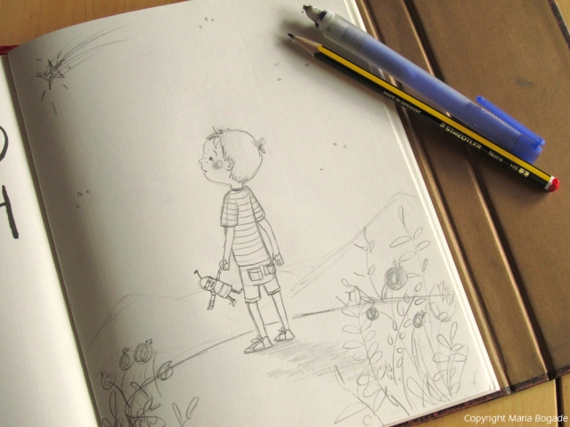
The sketch.

Do you have any tips on the production process?
This is hard, as actually I could probably ramble here for a while. I do use Photoshop to prepare my illustrations for printing. When illustrating or scanning in art, I work in RGB. Once the illustration is done in order to print you have to convert it to a CMYK profile. I did a blogpost about this a while ago. You can read about converting your files from RGB to CMYK here: http://www.mariabogade.blogspot.de/2012/09/best-friends-illustration-tiny-how-i.html .*
When scanning in files I can only recommend scanning them in as big as possible meaning with at least 800 dpi, best 1200 dpi. You can down-sample in Photoshop once you have cleaned the image from all things that needn’t be there. Also with many scanners your colors get a little greyish. Simply adjust the levels of your file by using the Levels tool, which will give you a kind of diagram. You need to push the values by moving the slider set to 255 right below the diagram to a value between 240 -250 (this works best for me, but play with it) and the one set to 0 to something from 5 – 60, depending on if it is b/w or color and how strong a contrast you want.
When choosing my fonts I try to have something that looks either almost hand-lettered or has a rather clean graphic look. It has to go well with the illustration so this is different each time I do a new card. Most of the time, I play around a lot and flip through my fonts with the text already written out to get a better feel for what might work best and which direction to follow.
One basic tip would also be to work at a larger scale than the actual postcard no matter if you work traditionally or digitally. You never know what might come of a card and this way you can also use it for prints if you like.**
*See you over there, everyone!
**Great tips— take note, all.
Do you use any online services? What are your favorite places to get postcards printed?
I print my cards at a company called www.unitedprint.de. I have tried others like Moo and what not, but I was not happy with the prices let alone the quality so I can only recommend unitedprint although I think you have to speak German to understand their site ;-).*
*Darn! Ich spreche kein Deutsch. (Danke, internet translator.)
Thanks so much for having me, Dana!
A big DANKE to Maria for all this helpful information and beautiful illustrations! Machs gut! Alles Gute! Bis zum nächsten Mal! (pleeease let that mean what I think it means…)
A few clicks and you’ll be enjoying more of Maria’s work:
Website: www.mariabogade.com
Blog: www.mariabogade.blogspot.com
Twitter: https://twitter.com/mariabogade
Facebook: https://www.facebook.com/MariaBogadeIllustration
___________________________________________________________
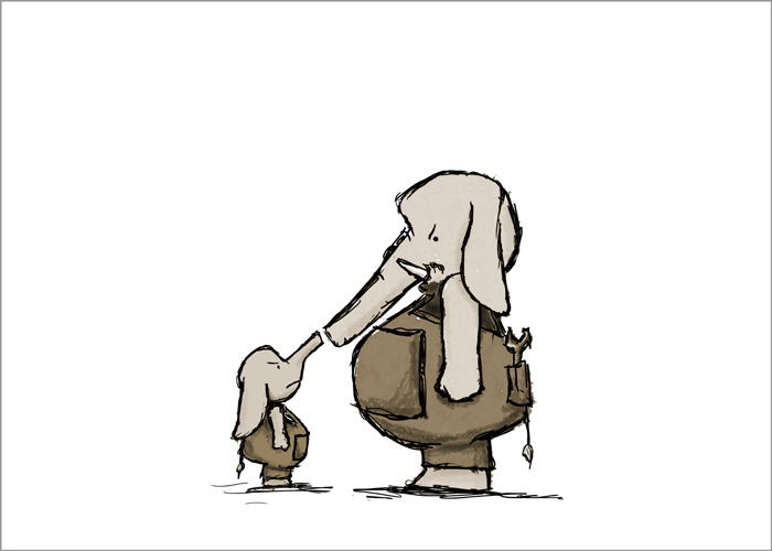
The December Postcard Post: Fred Koehler
Author/illustrator Fred Koehler shares some great tips and a postcard with The Sub It Club this month. Enjoy!
Fred Koehler wrote and illustrated his first book at age seven titled SAMMY THE SHOESTRING. It went on to win a shiny gold star sticker and an iced cinnamon bun from the vending machine in the teachers’ lounge. From that point on, Fred has never stopped doodling or writing stories. His first title as author/illustrator debuts from Penguin/Dial in Spring 2014 titled HOW TO CHEER UP DAD. He lives, works, and plays in Lakeland, Florida.
-
OK… I need to know what happens next. PLEASE.

How do you choose the image(s) for a postcard?
I really love it when an art director from a big five publisher says “Use this image on a postcard and you’re going to get a book deal.” Since that doesn’t happen every single time,* I tend to gravitate toward images that express a simple, universal emotion. Beyond that, I look for an uncommon juxtaposition or interaction that engages the curiosity of the viewer and makes them want to know the rest of the story.
*Can’t believe that!
Do you prefer text on the front of the postcard with the image or do you prefer all text on the back of the postcard?
The super-smart author/illustrator Jarrett Krosoczka taught me that words and pictures are jealous lovers. I think that means that you give equal attention to both at your own peril.* My preference is to have an image all by itself on the front with no text. But sometimes short text can creep in if it makes it funnier or pushes the story further.
*Good point.
-

Take a minute and read the text here. Also, I love that little elephant checking out the possiblities!

Do you create illustrations specifically for your self-promotion pieces?
My sketchbook and I are pretty tight. I draw during meetings, during church, while I’m on the phone, and probably lots of other times I shouldn’t be. Every single sketch is part of an exploratory process toward a concept that will hopefully be a book one day. So in reality, every illustration I create is for self-promotion.
Some illustrators create a series of postcards and send them out over time. Do you create a series or stand-alone images?
I LOVE to see it when illustrators are thoughtful enough to execute a concept across several postcards. It does, however, make me jealous that I’m not as clever as they are and have never found the right idea to do it.
How often do you send out postcards?
Not nearly enough. I’ve often felt that my writing is stronger than my illustrative ability, so I’m always second-guessing whether or not a particular image is “good enough” to represent me as both writer and illustrator.* Those images are few and far between. So are the postcards.
*Second-guessing. Writers do this. Illustrators do this. As a writer and an illustrator you do this twice. Second-guessing x Two = Fourth-guessing?
Who do you target with your mailings?
Like every aspiring artist, I would like to reach a magical market segment called “anyone who will pay attention.”* For my ideas and pictures, that segment seems to be children’s publishing. And since my process pushes toward a book idea, I’ll send to both editors and art directors. This particular postcard was mailed out to art directors and eventually landed on the desk of Kate Harrison at Dial Books for Young Readers. She read the story that went with it and signed up a two book deal.**
*I’ve heard of these elusive people…
**A two-book deal! Congratulations x Two = YAAAYYYY!
How do you compile your mailing list? Any tips on keeping a list and sending out?
Oooh. Here’s a great place for a super-secret pro tip*. Several years ago a small group of us got together to start a group blog. We voluntarily compiled our lists of editors and art directors to make a colossal master list. We kept it in a simple spreadsheet.**
*Love the sound of this!
**Brilliant.
Do you have any tips on the production process?
I heart Helvetica. And Helvetica Neue. And Franklin Gothic Condensed. And hand lettering. But more importantly, I prefer to design and select fonts in such a way that the art takes center stage and everything else blends into the background. If the art is incredible, I believe you could scribble your contact information in crayon and you’ll still get the call.
Do you use any online services? What are your favorite places to get postcards printed?
My greatest successes have come with small local printers and mail processing shops. I know I could upload everything to some website in the middle of nowhere for a lot less money, but my local printers know me and they go way, way, way above and beyond to make sure I have what I need and that it’s correct.
Thanks so much for sharing all these wise words, Fred. And I hope that one day I will know what happened next with those elephants!
Check out Fred and his work at these convenient locations:
Blog: Freddiek.com
twitter: @superfredd
flikr: superfredd
___________________________________________________________
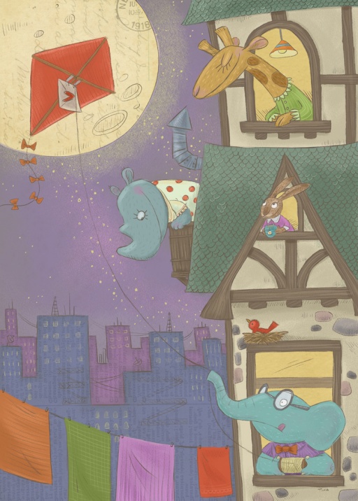
The January 2014 Postcard Post: Tina Kugler
I met Tina Kugler on twitter and was blown away by her work and lively twitter feed. If you don’t know her illustration work already, you’re in for a treat. She has tips too. Take it away, Tina!
Illustrator Tina Kugler lives in the Los Angeles area with her artist husband, three very loud boys and an enormous hairy dog named Harryhausen.
-
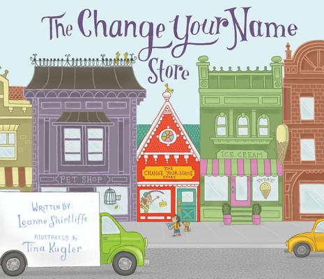
Tina’s picture book illustration debut is THE CHANGE YOUR NAME STORE, written by Leanne Shirtliffe, published by Sky Pony Press.
Tina spent ten years drawing storyboards in the animation industry, owned a children’s bookshop, and worked in the youth department of a public library. She is also a Cub Scout leader and has little to no spare time.
This one is…the postcard that WORKED. I have been sending out postcards for over ten years now. I’ve been trying and trying to get published, and this is the first postcard that EVER got me a bite: a picture book called THE CHANGE YOUR NAME STORE, written by Leanne Shirtliffe, coming out in May 2014 with Sky Pony Press.
Which begs the question, why is anyone looking to ME for advice? Hahaha. Sorry.*
*This is great advice for all of us! A testament to persistence.
-
I love everything about this postcard. How can I get on Tina’s mailing list?
How do you choose the image(s) for a postcard?
I usually give myself an assignment— so the image is more narrative than, say, a single character standing still. For this particular one, I thought about what I would do if I ever had the opportunity to do the cover of a SCBWI Bulletin, which always features a kite.*
*I thought of SCBWI the minute I saw this image. It should be a cover!
Do you prefer text on the front of the postcard with the image or do you prefer all text on the back of the postcard?
I’m all party on the front, business on the back—* I prefer to have full-color art only on the front, without any info on it to distract from the art. On the back, I do a smaller image (either grayscale or color) and put all of my information there. Always, always, always list your website address! At the SCBWI summer conference, I picked up illustrators’ postcards and business cards that didn’t list a website— just a phone number! How is someone going to see more of your work? Is an art director or editor going to call you based on one image? ** Even a blog URL is acceptable. Also (and I didn’t do this on this one), include your Twitter handle or other social media info, if you use it. And finally, if you have an agent, include their contact info as well.
*HA! That is hands down the best answer for this question!
**Hee hee. Now that you mention it, it does seem silly. Trying to imagine that phone conversation…
-
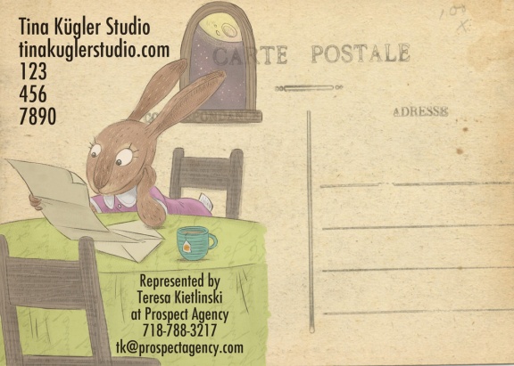
The “business on the back” of this carte postale is magnifique. Vraiment!
Do you create illustrations specifically for your self-promotion pieces?
Yes, but for my next mailing, I am going to feature art from THE CHANGE YOUR NAME STORE, so I can print a double batch to promote the book itself too.*
*Book promotion! Another excellent use of the good old postcard.
Some illustrators create a series of postcards and send them out over time. Do you create a series or stand-alone images?
I just do a two part on one card— image on back relates to image on front, either giving more of a story or like the punch line to the setup on front. I vary the subject matter on my cards, for example, one mailing will be kids, and the next one will be animals, and so on, in order to show the widest variety.
-
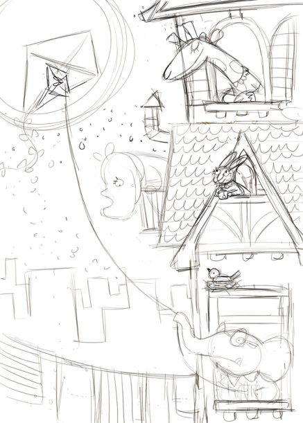
Sketch.
How often do you send out postcards?
My goal this year is four mailings— don’t know if I’ll make it! I usually manage 2-3 a year.*
*Good luck with 4 but 2-3 is still really good.
Who do you target with your mailings?
The SCBWI has an amazing book with addresses, between that book* and my awesome agent Teresa’s suggestions I’ve cobbled together a list. It is primarily children’s publishers. I don’t have many magazines on there, but my dream since age 5 was always to be published by Highlights Magazine, so I keep them on my list. Somedaaaay.**
*That book is called THE BOOK and it’s free to members: find it here.
**Sub It Club’s fingers are crossed for you. That’s a lot of fingers so good news should be on the way.
How do you compile your mailing list? Any tips on keeping a list and sending out?
I used to use my Address Book on my Mac, but after an extremely unfortunate incident involving my 11-year-old and his iPod and iCloud, MY ENTIRE MAILING LIST was deleted off of my desktop.* So now I have everything in a Word document, completely disorganized. (I’ve gone back to a Moleskine pocket calendar, perhaps I will do the same for addresses.) I address my postcards by hand, because I prefer the personal touch, and sitting and addressing them all with a mug of tea is sort of a meditative thing. (I need more meditative things.) I love the process of imbuing each little card with a wish while I address it, and then sending it out into the world (and pretending they are not all immediately swept into office recycle bins in NYC).** The process also helps me to be familiar with the names of the recipients, more so than slapping on labels.
*Chills down spine! The horror!
**Banish the thought!
Do you have any tips on the production process?
For being a digital artist, I am horrendously bad with various programs, like Photoshop. Well, I’ve never taken classes, and I’m too lazy busy to look up tutorials, so there we are. I usually do my font placement in Illustrator. Futura is my standby, it seems to be a good basic font that works with my style, although occasionally I use something else. Make sure you leave room to keep your text clearly legible. Don’t choose a font that overwhelms your art, you want your work to be the star— it should complement but not distract.*
*Excellent advice.
-
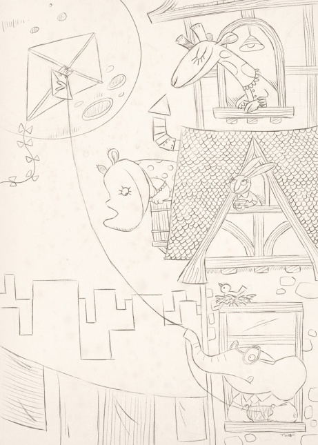
Now, this is much tighter but still so expressive.
Do you use any online services? What are your favorite places to get postcards printed?
I recently discovered GotPrint* (suggested by illustrator friends), they are wonderful- great color & quality, reasonable prices. They can do a rounded corner, which is a favorite of mine, sturdy weight, and a nice gloss. (As a bonus, I loved that I could pick them up nearby in Burbank versus having them shipped.)
*I checked and they have sites in Germany, France, United Kingdom, Netherlands, Belgium, Austria, Ireland as well as the USA.
Well, that was fun. Much thanks to Tina for a great interview chock full of helpful tips and wonderful illustrations. Don’t forget to check out her website and social media and especially her upcoming books. All the links are here:
Website: http://tinakuglerstudio.com
Twitter: @tinatheatre
Facebook: https://www.facebook.com/tinakuglerstudio
___________________________________________________________
The February Postcard Post: C.S. Jennings
I met C.S. Jennings through his very fun and lively twitter feed. Get ready for great images and helpful advice (on production tasks too) to follow. Enjoy!
C.S. Jennings is a professional illustrator and sometimes author specializing in concept work, children’s, and editorial illustration. He is the author of ANIMAL BAND and HELLO, TEXAS! He is the illustrator of his picture book ANIMAL BAND, Dial Books for Young Reader’s JACOB WONDERBAR chapter books by Nathan Bransford, Capstone’s THE INCREDIBLE ROCKHEAD graphic novel series by Scott Nickel, and A SERIOUS CASE OF THE SILLIES, published by Scholastic.
How do you choose the image(s) for a postcard?
First, the drawing has to make me smile or laugh. I think images with emotional connection have the most impact. Next, I imagine it tacked to a wall, so the image needs to read from five feet or so. Also, it will echo the kind of work I want. I’ve recently done lots of chapter book work, so my postcards now carry my picture book techniques.

this postcard originally had text on top.

(This isn’t the final version of the postcard: keep reading!)
Do you prefer text on the front of the postcard with the image or do you prefer all text on the back of the postcard?
I put the text on the back. I let the illustration do all the talking. Occasionally, I will put my logo on the front, but only if it works with the composition of the drawing. Personally, I never create a composition around the logo. I use text sparingly, keeping it large and legible. I use fonts that are really easy to read. (The point here, afterall, is communication, and while a font may delight you with its whimsy, if your information is not legible, that’s a fail.)*
*Communication is key!

Do you create illustrations specifically for your self-promotion pieces?
Not really. I’ve always got several drawings I am working on, from rough to almost final. I pull from those as they represent my newest ideas and techniques. Some illustrators create a series of postcards and send them out over time.
Do you create a series or stand-alone images?
I don’t do series postcards. But—haha—that’s such a cool idea.* If I were doing a series I think it would be important to build in as much character and setting variety as I could.
*Thanks! You’ll have to come back and show us if you do a series, OK?
How often do you send out postcards?
I send them four times a year.
Who do you target with your mailings?
My mailings target children’s magazines and children’s publishing art directors. I’ve done lots of magazine work and I love the quick turnaround deadlines of that industry. Plus, one of my favorite parts of the work is the people I get to work with. More clients means more fun in that regard. Even if your goal is to illustrate books, magazine work isn’t slumming. It pays the bills and offers real world opportunities to work with art directors. It teaches the practical side of things, like meeting deadlines and integrating client feedback to roughs and final art.*
*Great advice! So much to learn in these situations.

How do you compile your mailing list?
Any tips on keeping a list and sending out?
I use the same methods most people do in gathering that information–THE CHILDREN’S WRITER’S AND ILLUSTRATOR’S MARKET and SCBWI’s (I am a member)* THE BOOK. I also peruse the children’s magazine and book sections of bookstores looking for publications where my style will fit. With the magazine, I take a shot of the addresses on the publisher’s information page with my phone, or I just buy the magazine. To manage my list, I use Excel and import the addresses into Indesign utilizing its variable data capabilities.
*Me too. Great organization and THE BOOK is a big help.
Do you have any tips on the production process?
I draw all of my line with graphite (.5, .7, and .9 mechanical pencils loaded with B lead or Col-Erase), I scan at 400-600 dpi, and then add the color digitally in Photoshop. Ideally, with your files for press, work at no lower 300 dpi at 100% (the rule of thumb is, if you need to, you can then enlarge the art 200% before losing image quality). Remember to include “bleed”! If your postcard is 5″x7″, and you want the color to go to the edge, you need to create a 5.5″x7.5″ image. This provides a .25″ area outside of the live postcard area. Printers need bleed, otherwise you would get a white line on the edges. (Even the most precise cutter has a .125″ variance shift.) See my sample jpg for what this looks like. As I am one, I follow the graphic designer’s rule of no more than two fonts. Never use all capitalized letters in a brush script font, and for the love of all that is holy, don’t use the font Comic Sans (it’s cliché and there are so many outstanding fonts out there). Also, the font represents you, so make your choices early and stick with them throughout all of your mailings.*
*Wow! I hope everyone is printing out all that concise, important info.

Do you use any online services? What are your favorite places to get postcards printed?
I use a local print shop I have a relationship with. I like the ability to work directly with a person to be sure I get the results I expect. Plus, I get to handle the papers (I am a paper nerd)* and talk through all the options with them. In the end, they are cheaper than when I have had my cards quoted online and I get a great product every time (and if I didn’t, I have a person to go to).
*I have to admit I like to feel paper too. Paper Nerds Unite!
A big THANK YOU to C.S. for a very informative and inspiring interview!
You can see more of C.S. Jennings’ work at the links below. I highly recommend that you do.
Website: Csjennings.com
Twitter: @dajanx (where I am very active)*
Tmblr: http://csjdraws.tumblr.com
Blog: http://csjennings.blogspot.com
*I know! I really loved your tweet on “99 strange collective animal names”! Lots of important stuff going on on twitter.
___________________________________________________________
The March Postcard Post: Brooke Boynton Hughes
I knew I had to get Brooke Boynton Hughes to share her postcard tips after I saw her work on the Official SCBWI Conference blog. Brooke’s portfolio was selected as a runner up at the SCWBI Winter 2014 Conference in February. A jury of art directors, editors, and agents from children’s publishing chose from over 200 entries. Can’t wait to see this postcard!
Brooke Boynton Hughes grew up in Loveland, Colorado where she spent her childhood days drawing cats, mermaids, and tree houses. In 2001 she earned a BFA in Printmaking from Colorado State University. After a brief move to Austin, TX, Brooke headed to New York City where she attended the New York Academy of Art and earned at MFA in Figurative Art. Now she lives in Fort Collins, Colorado and illustrates books for kids. When she’s not drawing, Brooke can be found watching movies, hiking, or learning to play the ukulele. Upcoming books include CUPCAKE COUSINS by Kate Hannigan, published by Disney/Hyperion, BABY LOVE by Angela DiTerlizzi, published by Beach Lane Books, and MORE! by Linda Ashman, published by Random House.

How do you choose the image(s) for a postcard?
I try to choose an image that shows both a likable character and a compelling setting. The image should have a sense of narration and hopefully makes the viewer want to know more about the character’s story.*
*I do!
Do you prefer text on the front of the postcard with the image or do you prefer all text on the back of the postcard?
I always include my web address (www.BrookeBoyntonHughes.com) on the front of my card. I want editors and art directors to immediately associate my image with my name and for them to be able to easily find more of my work. On the back of the card I put my name, website, contact information, and any upcoming books.*
*Making the most of the back of the card!

Great promotional piece that demonstrates the versatility of postcards.
Do you create illustrations specifically for your self-promotion pieces?
In the past I’ve created images specifically for a postcard, but for me those pieces don’t seem to be as strong as pieces that I’ve created for a story idea. I think I prefer to use one of the strongest images from my portfolio so that there’s an obvious visual link between my postcard and my body of work.*
*Good strategy!

Some illustrators create a series of postcards and send them out over time. Do you create a series or stand-alone images?
I’ve only ever created stand-alone postcards, but I think that creating a series of postcard images sounds like a really good idea.*
*Thanks!
How often do you send out postcards?
It’s been years since I’ve actually mailed out postcards. I use postcards when I attend conferences, which is usually 2 or 3 times per year.* But, I’ve heard that sending out postcards every three months is a good idea.
*Good alternative use of the postcard.
Who do you target with your mailings?
I think it’s important to target art directors and editors who make the kind of books that I’m interested in making. I think a carefully researched, well targeted, personalized mailing of 20 cards has a much greater chance of being affective than a general mailing of 200 cards. If you’re only interested in illustrating children’s picture books, then it doesn’t do you any good to send cards to publishers that specialize in YA.*
*Good point: target and research!
How do you compile your mailing list? Any tips on keeping a list and sending out?
When I was doing regular mailings I relied heavily on CHILDREN’S WRITERS AND ILLUSTRATORS MARKET to figure out who was publishing what. If the description of a publisher in the Market book sounded promising, I would do further research of that publisher to decide if my work might be a good fit for them. I also looked at the picture books that I liked to see who published them.* Attending SCBWI conferences has been a really good way to learn about the preferences of specific art directors, agents, and editors.
For me, sending out postcards in small batches felt more manageable. I’ve used both spreadsheets and hand written lists to keep track of what I’ve sent to whom.
*Excellent way to research potential clients!
Do you have any tips on the production process?
I use Photoshop to design my postcards and I spend a lot of time experimenting with different fonts. I think as an illustrator it’s important to show a strong sense of design in your postcards. The text should be clear and easy to read and the words and images should work together as a whole.
When I’m setting up a file for a postcard I make sure that it adheres to the specifications of the printing service I’m using and that I’m taking into consideration extra room for bleed and trim size.
Do you use any online services? What are your favorite places to get postcards printed?
I use OvernightPrints.com. For the most part I’ve had really good luck with them, although I do recommend getting a printed color proof if you have time. OvernightPrints does rounded corners, which I really like.
Thanks so much for sharing these great tips, Brooke.
You can see more of Brooke’s work here:
website: www.BrookeBoyntonHughes.com
twitter: @BrookeBHughes
___________________________________________________________
The April Postcard Post: Elizabeth O. Dulemba
Sub It Club is very happy to pre-celebrate the launch of author/illustrator Elizabeth O. Dulemba’s first novel: A BIRD ON WATER STREET on May 7th. Elizabeth kindly took the time during this busy moment to answer our questions about postcards and show us her latest.
Elizabeth O. Dulemba is an award-winning children’s book author/illustrator with two dozen titles to her credit. She is Illustrator Coordinator for the SCBWI Southern region, a Board Member for the Georgia Center for the Book, and Visiting Associate Professor at Hollins University in the MFA in Children’s Book Writing and Illustrating program. A BIRD ON WATER STREET is her first novel (Spring 2014, Little Pickle Press).
 How do you choose the image(s) for a postcard?
I have to really like it. I don’t like everything I do.* It has to feel especially strong and make a good composition on the postcard size.
*A true artist!
Do you prefer text on the front of the postcard with the image or do you prefer all text on the back of the postcard?
I like to include very simple contact info on the front – name, phone, email, website – so that somebody wandering into an office might see it on a bulletin board (I hope), or they can reach me without pulling it off their board. I’ve paired down the text on the back of my next postcard even more to leave space to write a quick note to people I have met in person.

Do you create illustrations specifically for your self-promotion pieces?
Sometimes, it really depends on how much time I have. (Lately, not much.) But I do like to experiment and come up with challenges for myself. Much of my art comes from dummies in progress.*
*Author/illustrators: take note!

Some illustrators create a series of postcards and send them out over time. Do you create a series or stand-alone images?
Mine have usually been stand-alone images, although several images might come from a particular book dummy.
How often do you send out postcards?
On average about two to three times per year. But I also send out a monthly email art sample.*
*Excellent complement to the postcard mailings.
Who do you target with your mailings?
I send to publishers, editors, art directors, designers, and magazine folks. My mailing list includes about 300 names right now (which I actually think is too big).
How do you compile your mailing list? Any tips on keeping a list and sending out?
I tell people my mailing list is one of the most valuable tools I have. I’ve been gathering names for YEARS from trade magazines, the SCBWI Bulletin, Harold Underdown’s “Who’s Moving Where,” Publishers Weekly, Publishers Lunch, Shelf Awareness, etc. I really do try to keep track of people with my mac address book – it’s a work horse! I have two folders “Postcard Mailing List” and “Email postcard mailing list” where I keep everybody listed by name.
Do you have any tips on the production process?
When in doubt, keep it simple.* Don’t clutter your art by using too-fancy fonts, gradients and bizarre Photoshop effects. It’s distracting and steals the focus from your artwork. Remember that postcards will be printed, so 300 dpi is standard. And allow room for trim!
*Wise words!
Do you use any online services? What are your favorite places to get postcards printed?
I’ve been using OvernightPrints.com for years. I’m now a preferred customer and I wait for their sales* (they have a lot) before I order anything. They sometimes mess up on color or trimming, but they’ve always rectified any issues and I’ve been pretty happy with them overall.
*Sales! Yes, best way to buy!
Thanks so much for sharing your tips and beautiful work with us, Elizabeth. And have a great book launch!
Visit Elizabeth’s website. It’s chock full of great stuff and has a fabulous “advice” page with tons of links to helpful information. You can find out more about Elizabeth and her work at these links:
Website: http://dulemba.com
Portfolio: http://dulemba.com/portfolio.html
Facebook: https://www.facebook.com/ElizabethDulemba
twitter: @dulemba
___________________________________________________________
The May Postcard Post: Eliza Wheeler
I first saw Eliza Wheeler‘s work when her portfolio was selected for honors by SCBWI. I’ve since had the pleasure of working with her on a webinar for SCBWI France. So I can say from firsthand experince that her artwork is exquisite and she’s a great presenter! Sub It Club is thrilled she’s stopped by to share her postcards and some tips.
Eliza Wheeler is the author-illustrator of MISS MAPLE’S SEEDS (Penguin), which débuted on the New York Times bestseller list. She is also the illustrator of DOLL BONES (Simon & Schuster), the Newbery Honor winning novel by Holly Black, and Mara Rockliff’s picture book THE GRUDGE KEEPER (Peachtree). Eliza is the recipient of numerous Society of Children’s Book Writers and Illustrators awards, including the Grand Prize Award for best portfolio at the 2011 SCBWI National Conference. Eliza is a northern Wisconsin native, and currently lives with her husband in Los Angeles, California.

How do you choose the image(s) for a postcard?
I try to choose an image that; a. tells a story all on its own, b. has emotional pull, and c. that feels like a great overall representation of my voice. For this postcard, I decided to choose two: one to represent my darker, more mature work, and the other to represent picture-book work. This particular postcard’s purpose was to set out at an SCBWI conference, so I decided to use the whole front and back (rather than leaving room for mailing addresses).

Do you prefer text on the front of the postcard with the image or do you prefer all text on the back of the postcard?
I once heard an art director complain that if they pin up a postcard, it’s a bother to take it down to look for a name/site on the back. Since then I’ve always put my name and URL on the front.

Do you create illustrations specifically for your self-promotion pieces?
Not usually. Though, if I have an idea for a stand-alone piece that I end up liking, I often choose that one for a promo.
Some illustrators create a series of postcards and send them out over time. Do you create a series or stand-alone images?
I’ve only ever done stand-alone pieces.
How often do you send out postcards?
Currently only about once a year because I have such a packed schedule for the next year.* If I was less booked I would be shooting for 3-4 times a year.
*Yay! Here’s to packed schedules!
Who do you target with your mailings?
Mostly editors and art directors. I’ve also created promo cards for my books, and in that case I also send them to people I know who might buy the book, as well as indie bookstores.*
*More proof of the versatility of postcards.

How do you compile your mailing list? Any tips on keeping a list and sending out?
I try to keep an on-going list, and update it using the SCBWI Market Survey that comes out yearly. My agency (Andrea Brown Lit Agency) also has done promotional mailings that specifically target about 200 publishing pros, so it’s nice to have their expertise in this area.
Do you have any tips on the production process?
I’m lucky in that I’m coming from a graphic design background, so I’m very comfortable using Adobe InDesign, and have a trained eye for using type. For someone without a design background, I would suggest using minimal and classic fonts over something that’s too stylized. Amateur design-work can be a turn-off, so let the art speak for itself.*
*Great advice: keep it simple!
Do you use any online services? What are your favorite places to get postcards printed?
I’ve used online and local printers, and so far I’ve preferred the quality of the local L.A. printers to, say, Overnight Prints.com or Vistaprint.com, except that the price is usually lower online. The two printers I’ve liked in L.A. are Copyland (www.onedaycopy.com), and West Hollywood Printing & Copy.*
*A Postcard Loca-vore, so to speak!
Thanks so much for sharing your artwork and tips, Eliza.
Find out more about Eliza Wheeler at the links below.
Website and blog: www.wheelerstudio.com
Twitter: @WheelerStudio
Instagram: wheelerstudio
Facebook: Eliza Wheeler
___________________________________________________________
The June Postcard Post: Kirsten Carlson
This isn’t the first time I’ve seen this month’s postcard: I saw it develop from a sketch to the finished glory you’ll see below. I knew I’d have to share it here as well as Kirsten Carlson‘s tips and advice. Sub It Club is happy to welcome Kirsten to the Postcard Post!
Kirsten Carlson has one creative foot in science and the other in art. She has been an illustrator and designer for 20 years. Her illustrations were first discovered by a publisher at an SCBWI New York conference, which led to her first project as a children’s book illustrator, THE GIRAFFE WHO WAS AFRAID OF HEIGHTS, published in 2005. Her latest publication as both illustrator and writer is WHERE THE LAND AND SEA MEET, a nonfiction activity book. She is currently developing several picture book stories that are animal and nature inspired.

How do you choose the image(s) for a postcard?
This postcard illustration evolved out of a professional SCBWI France webinar series called Project Portfolio.* Our challenge was to create an illustration that showed a group of characters sharing a meal. During the process, I decided it would also be great as a postcard illustration.**
*Hmm. That rings a bell!
**You were right: it is.
Do you prefer text on the front of the postcard with the image or do you prefer all text on the back of the postcard?
It depends on the illustration. I designed this postcard with my name and title on the front, so that there is no need to flip the card over. In the past I’ve wanted the impact of an illustration alone, and other times, I’ve used a tag line, because the promo piece was geared for a specific book or project.

Do you create illustrations specifically for your self-promotion pieces?
No, I’d rather produce the art for a story or for a project, and then ALSO use it as an added bonus in a postcard or promotional piece.*
*Ah! A multi-tasker.
Some illustrators create a series of postcards and send them out over time. Do you create a series or stand-alone images?
I love the idea of sending out a series; that seems like it could dovetail well with showcasing a picture book dummy. This illustration could become a series as it does have a story.*
*Don’t be coy! Tell us the story.

How often do you send out postcards?
Although I’ve created several promotional pieces and postcards, it’s usually been for conferences or as handouts. This is the first time I’m officially sending out a children’s book promotional postcard mailer into the world with stamps and addresses and personal notes to art directors, publishers, and agents.*
*Postcards are so versatile. Good luck with this mailing!
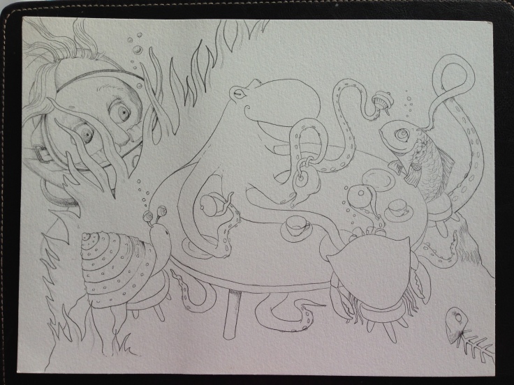
Who do you target with your mailings?
I definitely believe in doing a targeted mailing. I’ve met some amazing agents, publishers, art directors and editors over the years but I don’t want to waste their time if my work doesn’t match their publishing style. For this postcard, I’m sending it to a list of less than 50 publishing professionals.
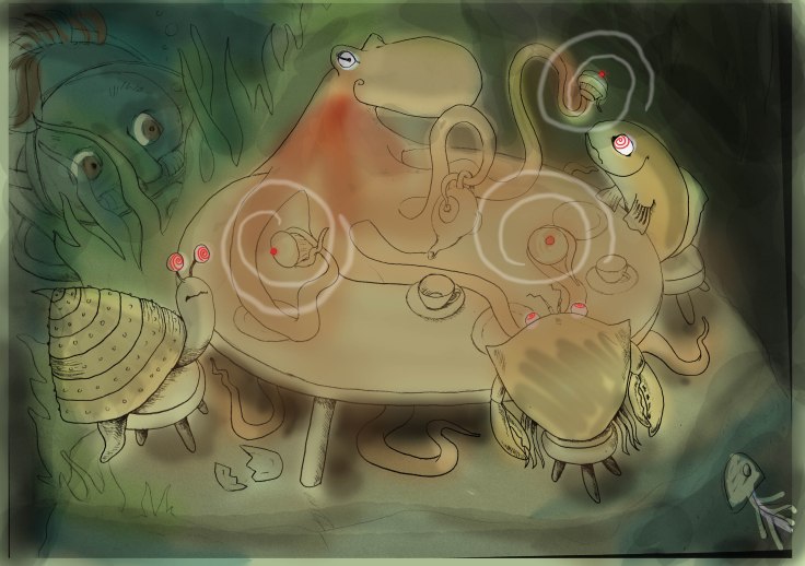
How do you compile your mailing list? Any tips on keeping a list and sending out?
I use an Excel spreadsheet, I’m extremely comfortable with that interface to organize everything. I have a mailing list (primarily email) of about 500 people (not all publishing professionals). It does take time to find physical mailing addresses so I asked for help from my more-active-postcard-mailout-illustrator cohorts.* That has been tremendously helpful and time-saving.
*Intriguing. So you’re in cahoots with these cohorts.
Do you have any tips on the production process?
I’m a graphic designer so I totally geek out on designing a simple 4 x 6 area, sometimes it takes hours. My suggestion is to use 1 or 2 fonts, keep it simple, make the information easy to find and easy to read. I use Adobe InDesign, Illustrator and Photoshop. I always get the template for the particular card I’m creating so I know how much room the printer needs for bleed, and how close I can put type to the edge.
Do you use any online services? What are your favorite places to get postcards printed?
I print most often with Vistaprint.com, but this postcard has been challenging for them (see samples)*. I also use Zazzle.com and I tried out Moo.com for business cards. They are more expensive but I’ve been impressed with both of them. I’ve also worked with local printers, and enjoy meeting face-to-face but there are so many online options these days, I haven’t worked with a local printer in several years.

Thanks so much for sharing your artwork and tips, Kirsten.
Find out more about Kirsten Carlson at the links below.
Website: www.kirstencarlson.net
Blog: www.artsyfishy.com
Twitter: @kirstencarlson
___________________________________________________________
The July Postcard Post: Kelli Thrasher-Brooks
When I saw on Facebook that illustrator Kelli Thrasher-Brooks had a new postcard ready, I knew she’d have to come share it with the Sub It Club.
Take it away, Kelli:
Colors, textures, lines, patterns and characters play a large role in Kelli’s passion for creating picture books. Ideas for new stories come from everywhere and she is often inspired by her children. When she has a strong character concept she draws them over and over loosely with a lot of layers and emotion until they come to life. She paints many textures with her children and scans them in to add depth to her illustrations in Photoshop. When she draws with ink and watercolor pencils, she uses just a small amount of saliva and a Q-tip to blend the colors perfectly since water often makes them muddy. It’s like every drawing has a personal piece of her life in it… literally!
Kelli attended the Art Institute of Philadelphia from 6:00-10:00 every night and worked for ad agencies full time during the week to pay her way through college. After graduation, she jumped right into advertising and has been in the field for over 16 years now.
Beginning in 2007, bedtime stories with her children enhanced her storytelling skills and appreciation for picture books all over again. Her children love to add on to the stories each night and color her custom coloring pages as well.
In 2009 she joined SCBWI and a new world opened her eyes. It was a home that she never realized that she was missing. It blended perfectly with her love of picture books, the desire to create stories and make a difference in lives.

How do you choose the image(s) for a postcard?
Most images in my portfolio are like little seeds of stories that I am working on. I test out images in different ways to see what gets a good reaction. Facebook, Twitter, and Instagram are helpful resources. The most recent image on my postcard has been popular for a while now and was even featured on Harold Underdown’s Facebook page on September 1, 2013.
Just the other day I handed over my credit card (which has this illustration on it) to a cashier at a store and she lit up! I get that reaction often, but this illustration really touched her and she asked if she could buy a print! Moments like that remind me why I love to draw.*
*Wonderful!
Do you prefer text on the front of the postcard with the image or do you prefer all text on the back of the postcard?
I used to cram in a lot of information when I was more insecure with my work. It has taken a few years to realize that the art and stories speak for themselves. Previous postcards used to have anywhere from 5-10 images crammed on the front and back, but now I use one strong image on the front with my name, and the back of the card has four favorites with important contact info. If they want to see more, they’ll visit the website.

Do you create illustrations specifically for your self-promotion pieces?
I love to create stories that make me happy. If I get a good reaction from an illustration I might use it, but your gut always lets you know. I’ve created illustrations and manuscripts that I wanted to love, but I knew they were not quite right. Art directors and editors want to see your best work, and if you are not sure… leave it out. Quality is more important than quantity.* You will accumulate better pieces over the years, so don’t rush it.
*Words to live by!
Some illustrators create a series of postcards and send them out over time. Do you create a series or stand-alone images?
I only create one card at a time. Postcards are often shared in the slush pile so you would think it would be nice to send a different card to each person, but I personally think that if they saw the same image in the pile a couple of times, it might get noticed more or show that more than one person likes the image.

How often do you send out postcards?
I have not sent out many postcards so far. I used to send a couple during the holidays to personal contacts, but I have been focusing more on creating a specific mailing list… quality not quantity. I have either met them, been influenced by them personally or have researched the contacts in my mailing list based on the books that they have worked on. I can also see my style working well in the mix of their current artists.
A good list is like a closet full of your favorite shoes… it just feels complete every time you open it up. There is always room for more though!*
*Ha! You can say that again!
Who do you target with your mailings?
I have been working on the list for a few years. Everyone’s list is going to be different based on your taste in books and comfort level. I tend to mail to art directors and editors. I have gotten to know a few people from Highlights after attending the Advanced Illustrator Workshops in 2012 and 2013, so I usually mail a postcard to them as well.
 How do you compile your mailing list? Any tips on keeping a list and sending out?
Lists can be so overwhelming. Still trying to find a good formula… For now I use a spreadsheet that I created in free program called Open Office, which is just like Microsoft Word and Excel. I have a row across the top broken up into columns for: Publisher, Title, First, Last, Address, City, Zip, Phone, Email, Updated and Notes. Then down the left hand side of the page under “Publisher” I have sections separated by each publisher and imprint.
Do you have any tips on the production process?
I sometimes illustrate on paper, and then scan it in to color in Photoshop, and add in textures that I have painted. Drawing in Photoshop with the tablet is fun and I feel like I am a bit looser with my lines, so sometimes I just start an illustration there.
The graphic designer in me defaults to InDesign for all layout purposes though. It keeps the files smaller and you can move around text and photos more easily. As long as you send the printer a PDF with correct bleeds and dimensions you should be okay.
Do you use any online services? What are your favorite places to get postcards printed?
I love working with Overnight Prints. The quality has been great so far, and they are fairly quick. The cost is helpful too! I LOVE Moo‘s cardstock though, and the feel of their cards is always noticeable. If I’m going to an SCBWI conference I usually print a set from them as well.
Thanks so much for all the tips and beautiful artwork, Kelli!
To see more of Kelli’s work and learn more about her process, click here:
Website: www.kellithrasherbrooks.com
Twitter: @kthrasherbrooks
Blog: kellithrasherbrooks.blogspot.com
___________________________________________________________
The August Postcard Post: Stephen Macquignon
Stephen Macquignon is an illustrator of picture books. He has illustrated ten books in the past six years including WHY AM I ME?, FERDINAND FROG’S FLIGHT, and THE MARSHMALLOW MAN. Stephen’s latest project is an eBook written by Chrissi Hart and published by Xist Publishing called TEA WITH THE QUEEN. It will be available for sale on December 4, 2014. He is also a semifinalist in the current SCBWI Tomie dePaola Awards contest.
How do you choose the image(s) for a postcard?
It all depends. If I am going to the SCBWI conference, I like to have an illustration chosen from my portfolio. If I’m doing a mailer, I will do some sketches until I feel one is right and make it into a postcard.

Do you prefer text on the front of the postcard with the image or do you prefer all text on the back of the postcard?
I prefer just the image on the front and use the back for all the contact information.
Do you create illustrations specifically for your self-promotion pieces?
Sometimes. The one that is being shown here, the “sleeping bear” was made specifically to be used as a postcard.

Some illustrators create a series of postcards and send them out over time. Do you create a series or stand-alone images?
I usually create stand-alone images, but now that you mention it, a series is not a bad idea.
How often do you send out postcards?
Twice per year.
Who do you target with your mailings?
Art Directors, editors, assistant art directors, within children’s publishing are my main focus. Most agents I have been in contact with want samples to be e-mailed.
How do you compile your mailing list? Any tips on keeping a list and sending out?
I use Linkedin and Twitter to find out the names of art directors.
Do you have any tips on the production process?
Photoshop and a high quality scanner/printer are essential.
Do you use any online services? What are your favorite places to get postcards printed?
I like Vistaprint.
Thanks, Stephen!
If you’d like to see more of Stephen’s work, click on the links below.
All of his sites can be accessed here: http://www.jacketflap.com/StephenM
To see the many different stages of his postcard: https://www.facebook.com/media/set/?set=a.725913617448698.1073741835.109146305792102&type=3
___________________________________________________________
The September Postcard Post: Charlie Eve Ryan
I first saw this month’s featured illustrator’s work on Facebook and instantly knew I had to see more. Sub It Club is thrilled to welcome Charlie Eve Ryan. Sit back and enjoy her wonderful postcard and tips too!
Charlie Eve Ryan is a professional freelance illustrator/writer and member of SCBWI. In 2012, she was accepted into and attended the Highlights Foundations Advanced Illustrator Workshop. She has a fondness for digital watercolor, pencil, pastels, mixed media paint and ink. She lives happily at the top of a hill in a creaky old house with her hubby and their two little ones. She is represented by Fiona Kenshole at the Transatlantic Agency.

How do you choose the image(s) for a postcard?
It varies each time. For this one, it was sent out in the spring, so I wanted a light mood but with a variety of expressions. I opted for a simple spot illustration with a lot of white space. I love drawing birds and little girls so it felt right at the time.*
*Spoiler Alert! The girl is coming up next.
Do you prefer text on the front of the postcard with the image or do you prefer all the text on the back of the postcard?
For this one I put it all on the back, but I have done both ways before. In the future, I will probably put at least my name on the front. I think if it is lucky enough to get picked out the pile, it could make it easier for the potential client to look up your portfolio, etc.

Do you create illustrations specifically for your self-promotion pieces?
Sometimes I do and sometimes I don’t. If I have a current piece in my portfolio that I want to highlight, I’ll use it and save time. But, if I have a specific idea at the time that I am thinking about doing when promo time comes, I will work up the idea for the card.*
*Some ideas just won’t wait!
Some illustrators create a series of postcards and send them out over time. Do you create a series or stand-alone images?
I have only done stand-alone images. I send out 3-4 times a year, so I don’t know if anyone would pick up on the series aspect, but that could be fun for the artist and a good challenge.
How often do you send out postcards?
3-4 a year. I’m actually due for a new batch now! 😀*
*Looking forward to seeing it!
Who do you target with your mailings?
Mostly editors and art directors in children’s book publishing and children’s magazines.
How do you compile your mailing list? Any tips on keeping a list and sending out?
I usually make note of any changes or add ons by hand when I read about an industry change and then I update my list in a computer file. It is an ongoing challenge to build a contact list.* Publisher’s Lunch and Publisher’s Marketplace are a great way to try and keep track on the goings on in children’s publishing with editors and art directors movements between houses.**
*I hear ya!
**Good advice.
Do you have any tips on the production process?
I mainly work digitally and rarely find the need to scan things. My head wants to explode when I think about scanning and resizing files, so I am grateful for the ease of Photoshop.* I am exploring InDesign, too.
*Well, now I’m thankful for Photoshop too– we can’t have your head exploding. We want to see your next postcard!
Do you use any online services? What are your favorite places to get postcards printed?
I’ve used overnightprints.com and us.moo.com, both are great and worth it. Moo has some really fun creative options for promos (bookmarks, stickers etc.).
Thanks for having me, Dana!
Thank YOU, Charlie Eve!
Click on the links below to check out more of Charlie Eve’s work!
Website: www.charlieeveryan.com
Twitter: @charlieeveryan
Facebook: https://www.facebook.com/charlieeve.ryan
Pinterest: http://www.pinterest.com/charlieeveryan/
___________________________________________________________
The October Postcard Post: Elizabet Vukovic
I met this month’s Postcard Post illustrator through SCBWI and have had the pleasure of seeing her work on many occasions. Now she’s sharing it with Sub It Club. Without further ado, welcome Elizabet Vukovic.
Elizabet Vukovic is a freelance illustrator and SCBWI member. Born in Rotterdam, the Netherlands, Elizabet was brought up in a bi-cultural atmosphere by her Croatian parents. She graduated from the Academy of Art University, San Francisco in 2013 and recently quit her day job to dedicate herself fulltime to illustration for children’s books and other venues. She’s currently working on illustrating a middle-grade children’s novel by a Flemish publisher. Elizabet enjoys the journey with her two little companions, Jack & Max (her cats of course!).

How do you choose the image(s) for a postcard?
This is my first set of postcards. I printed two different postcards chosen from two pieces from my portfolio that I consider my strongest.*
*Portfolio pieces are a great choice.
Do you prefer text on the front of the postcard with the image or do you prefer all text on the back of the postcard?
Normally I wouldn’t place text on the front, but for promotional purposes I think it’s necessary to at least put your name there. That way, art directors and editors can find the creator of the piece without having to flip it. And the art is instantly associated with your name and hopefully that sticks!*
*Fingers crossed!

Do you create illustrations specifically for your self-promotion pieces?
For these cards I didn’t create new images except for the image on the back of the card of the boys at the farm and the pasture. I wanted to connect the front image with the back and demonstrate my ability to recreate the characters in other poses and emotions. Since the printer gave me the possibility of using more than one design for the back of the cards, I did that for both postcards.*
*Ooo! I like all the options you had from the printer.

Some illustrators create a series of postcards and send them out over time. Do you create a series or stand-alone images?
These are stand-alone images but in the future I think it could be fun to create a series. Art directors could instantly to your work and look forward to the storytelling of your cards.*
*Great point. A strong narrative is so important.
How often do you send out postcards?
These are my first but I plan on sending out every 2-3 months.*
*I’m going to check up on you in 2-3 months to keep you honest!

Who do you target with your mailings?
I plan to send the greyscale postcard (with the girl) to publishers of children’s books and specifically, middle-grade novels. I’ll send the color postcard (with the boys on the farm) more widely to children’s publishers, magazines, art directors, editors and agents.
How do you compile your mailing list? Any tips on keeping a list and sending out?
I made an Excel file where I put the date of when I approached a publisher, how I approached them (e-mail/postcard/meeting) and the date when I should approach them again. I also included whether or not I received feedback or advice.*
*I’m impressed! A talented illustrator AND very organized!
Do you have any tips on the production process?
I mostly use Photoshop and the printer moo.com has some suggested templates. Since my artwork is digital I can resize and recolor anything easily to work with them.
Do you use any online services? What are your favorite places to get postcards printed?
For these postcards I tried moo.com since I heard some positive feedback about them.*
*Your postcards look fantastic so I guess they’re getting some more positive feedback.
Thanks so much for sharing your postcards and tips, Elizabet. Very inspiring!
Elizabet (and Jack and Max) can be found at the links below.
See the rest of Elizabet’s portfolio and contact her!
E-mail: art.vukovic@gmail.com
Website: www.elizabetvukovic.com
Twitter: https://twitter.com/elizabetvukovic
Facebook: https://www.facebook.com/evukovic
Facebook illustration page: https://www.facebook.com/elizabetvukovicillustration
Instagram: http://instagram.com/elizabetvukovic
Tumblr: http://elizabetvukovic.tumblr.com/
LinkedIn: https://www.linkedin.com/pub/elizabet-vukovic
Google+: https://plus.google.com/u/0/+ElizabetVukovic
___________________________________________________________
The November Postcard Post: Julie Rowan-Zoch
This month Sub It club is happy to welcome author/illustrator Julie Rowan-Zoch to The Postcard Post. Many of you are probably familiar with Julie’s doodles via social media and if you aren’t, check out the links at the end of this post but don’t skip to the bottom– you’ll definitely want to read the interview first. Take it away, Julie!
Julie Rowan-Zoch grew up chasing hermit crabs on Long Island, New York and spent years slicing rich, dark breads in northern Germany before she found joy in blue Colorado skies. She makes her own if she wants decent bread now. She studied Advertising/Graphic Design at FIT in New York City, and the Hochschule fuer Bildende Kuenste in Braunschweig. Julie still loves design, but recently found her passion for writing, reading and illustrating picture books. She’s an active SCBWI member and 12×12 participant (3 years!), belongs to an online and a local PB critique group, and recently illustrated three board books for Bailiwick Press, released in October 2014.

How do you choose the image(s) for a postcard?
I have just made my first promotional postcard in preparation for the regional SCBWI conference in Denver in September. I pored over all the Sub It Club Postcard posts,* and any other I could google, like Molly Idle’s. I post a lot of doodles/quick digital sketches online, and chose a recent image that people had a positive reaction to, and worked on more sketches, keeping a possible storyline in mind. That’s when the image below ‘occurred’.
*Ooo! That’s us! 🙂
Do you prefer text on the front of the postcard with the image or do you prefer all text on the back of the postcard?
Listening to all the advice I mined, I decided to include my web address on the front, since it is also my name. I also added more contact info on the back, and incorporated the lighthouse image, a connection to the featured character and the (not yet drafted) story.

Do you create illustrations specifically for your self-promotion pieces?
In this case yes, but strongly influenced by a doodle.

Some illustrators create a series of postcards and send them out over time. Do you create a series or stand-alone images?
I will be taking the advice I picked up, and will create another in about three months’ time. I might continue with the story, as I now have a really exciting draft*, but I would consider another if I fall for another doodle!
*Phew! So glad the story is written. Can I have a peek?
How often do you send out postcards?
The plan will be for a new one every 3 months.
Who do you target with your mailings
After reading many submission guidelines, I have targeted publishing houses that I feel my style would be a great fit for, as well as some whose books and book design I admire, and a few select agents.

How do you compile your mailing list? Any tips on keeping a list and sending out?
As a member of SCBWI, I used THE BOOK, and googled a bit too. I am keeping a list, including the names of art directors AND editors.*
*Excellent plan– editors like postcards too!
Do you have any tips on the production process?
I use images created on a simple note-taking app on my android tablet, transferred and altered in Adobe Illustrator. I print out pdf and png and jpg files to compare printing differences in color and contrast. I am a type freak (!),* and here I went with something clean that would take a backseat to the illustrations.
*The freakiness paid off– the type works well!
Do you use any online services? What are your favorite places to get postcards printed?
I am a big on supporting local business when I can, so I did a little price shopping/test prints, and decided on a local business card printer. I like fancy cards as much as anyone, but I wanted the illustrations to do the work, not rounded corners or paper thickness, which made my decision an easy one.
Thanks so much for sharing your wonderful postcard, Julie!
Now that you’ve read the interview, it’s ok to click on the links below to see more of Julie’s work. You’ll love the doodles Julie posts daily!
Blog: http://julierowanzoch.wordpress.com/
Facebook: https://www.facebook.com/julie.rowanzoch
Facebook page: https://www.facebook.com/ArtistJulieRowanZoch
Pinterest: http://www.pinterest.com/julierowanzoch/
Twitter: @JulieRowanZoch
To see the post featuring the original inspiration doodle for the postcard click here.
___________________________________________________________
The December Postcard Post: Laura Zarrin
The Postcard Post welcomes author/illustrator Laura Zarrin. Read on to find out about Laura and pick up a tip or two.
Laura spent her childhood in the St. Louis area exploring creeks, woods, and attic closets, with plenty of tree climbing and digging for artifacts in the backyard all in preparation for her future career as an archeologist. She never became one because she realized she’s much happier drawing in the comfort of her own home while watching TV. Obsessed with the Little House books and Native American cultures, Laura drew lots and lots of pioneers and studied pictographs and books about that time period. When she was 12, her family moved to the Silicon Valley in California where she still resides with her very logical husband and teen sons, and their illogical dog, Cody.
She is represented by Justin Rucker of Shannon Associates.

How do you choose the image(s) for a postcard?
Since I’m promoting myself for picture books, I choose an image that tells a story. I start by going through my sketchbooks for ideas* and doing additional sketching. Now that I’m writing, I find something from one of my stories to illustrate.
*Good reminder to keep those sketchbooks handy.

Do you prefer text on the front of the postcard with the image or do you prefer all text on the back of the postcard?
Most of the info is on the back, but I make sure my name and website are on the front. My hope is that it gets hung on a wall where they’ll see how to contact me when that just right project comes in.*
*Good plan!
Do you create illustrations specifically for your self-promotion pieces?
Usually. Every once in a while, I create a piece and realize it’s perfect for a postcard, but it will usually need some tweaking to fit the format.

Some illustrators create a series of postcards and send them out over time. Do you create a series or stand-alone images?
I haven’t created any sequential mailings so far, but I do carry the story from the front to the back. That also helps show my black and white work.*
*Excellent use of all the postcard promo space.
How often do you send out postcards?
I shoot for 4-5 times a year with some email promos going out in between or instead of to key recipients.
Who do you target with your mailings?
Children’s publishing, magazines, educational clients, and some product manufacturers. I send to both art directors and editors.

Do you ever include a personalized greeting or note to the person you’re sending to?
Only if I’ve met or talked with them at some point in the past.
How do you compile your mailing list? Any tips on keeping a list and sending out?
I’ve been using Bento to compile my database and print labels, but it broke a couple of weeks ago and is no longer being supported by Filemaker which makes me very sad. I’m trying out Filemaker, but it’s too expensive and has way more frills that I need. I’m very careful to keep accurate records of what I’m sending to whom and the response I’ve gotten, so I need a new solution soon.*
*Dear readers: leave your solutions in the comments!
Do you have any tips on the production process?
Make sure you save often and back up every day. I use TimeMachine and have an off-site automatic back up running and I’m using ForeverSave. I’ve accidentally flattened art that needed corrections or saved a low-resolution version over the high resolution too many times. It’s so painful!*
I use Photoshop a lot, but I’m weaning myself off of it and onto Manga Studio, but it’s tough to be a beginner again.**
*Ouch! I think we can all commiserate.
**Again, lots of commiseration.
Do you use any online services? What are your favorite places to get postcards printed?
I use PsPrint. The postcards are really nice and you can buy them when they’re on sale, then upload the art later.
Thanks so much, Laura!
Check out the links below to see more of Laura’s work:
Website: LauraZarrin.com
Blog: Creative Whimsies
Twitter: LauraZarrin
Facebook: Facebook
Group Blog: Simply Messing About
___________________________________________________________
The Postcard Post: Roberta Baird
January 2015
The Postcard Post for January features Roberta Baird. You may be lucky enough to have already seen her illustrations on social media and beyond. If not, sit back and enjoy getting to know Roberta and her postcards.
Roberta Baird is an illustrator and writer. Her work has been featured in four books. One of her favorite books, THE SWAMP WHERE GATOR HIDES, published by Dawn Publications, won a 2014 Silver Moonbeam Award. Her latest book, THE RUNAWAY PUMPKIN PIE MAN, published by Pelican Books is due out in February of 2015. She has also worked in the educational market with clients such as Scholastic and McGraw-Hill. Roberta currently resides in Texas with her husband, kids and many furry and feathered friends. When not illustrating, she can be found painting murals and sets for the theater.

How do you choose the image(s) for a postcard?
When designing a postcard I try to choose an image that has a strong narrative, is relatable and represents the kind of work that I’m interested in doing.* It also depends on the target audience. I have gators in their natural habitat and other gators that are wearing top hats. The octopus, one-man band was a fun one to create.
*This last point is so important: targeting the work you really want to do.
Do you prefer text on the front of the postcard with the image or do you prefer all text on the back of the postcard?
It depends on the image. Sometimes if there’s extra space, which can happen if the artwork isn’t designed for the postcard, I’ll add my website information, but most of my postcards have an illustration, no text. I like the illustration to envelop the space with no distraction.

Do you create illustrations specifically for your self-promotion pieces?
Yes, most of the time they’re created for the current mailing and for the size of the postcard. It’s a challenge to create an image that tells just enough of a story and hopefully leaves them wanting to know more.* Sometimes when I’m working on a book, I’ll use a image that will serve as both a good postcard and promotional piece.
*You’ve made another great point! Meeting this challenge can be the key to a successful mailing.
Some illustrators create a series of postcards and send them out over time. Do you create a series or stand-alone images?
I haven’t done that. That’s an interesting idea to consider though.
How often do you send out postcards?
I send out postcards about every three to four months. I also throw in a holiday card if I have the time.
Who do you target with your mailings?
I send postcards to both editors and art directors as per their guidelines. I send to magazines and book publishers, both trade and educational. I’m interested in all areas of children’s publishing.

Do you ever include a personalized greeting or note to the person you’re sending to?
I do, but only if I’ve met them at a conference or worked with them in the past. Keep it simple.*
*Three words to live by!
How do you compile your mailing list? Any tips on keeping a list and sending out?
I use an Excel spreadsheet that I look over and update from sources such as SCBWI’s THE BOOK, (you know the one)* The Children’s Writer and Illustrator Market and the publisher’s own website under submission guidelines.
*Yes, I do! Attention SCBWI members: you can get THE BOOK at scbwi.org (but wait until you finish reading this post).

Do you have any tips on the production process?
Well, I used to send oversized postcards, which lead to oversize postage,* but I heard an art director say that 5×7 is just fine. It works for me. I sketch out and refine the artwork. I like to make a corresponding spot illustration for the back of the card, then I scan it and color it in Photoshop. After that, it’s uploaded it to the printer website as a 300 dpi, CMYK file, and if everything fits, no typos or chopped artwork, it’s good to go. Press upload and pay!**
*Ha! Live and learn!
**You make it sound so easy. 😉
Do you use any online services? What are your favorite places to get postcards printed?
I use GotPrint. I like the quality and the options available.
Thanks so much for all the tips, Roberta! So helpful!
Check out the links below to see more of Roberta’s work:
Website: www.robertabaird.com
Blog: A Mouse in the House
Facebook: www.facebook.com/roberta.baird.illustrator
Twitter: @robertabaird
Postcards and Beyond with Mark Fearing, Part One
February 2015
Sub It Club is thrilled to welcome illustrator Mark Fearing to help us celebrate our two-year anniversary. Mark is sharing some of his self-promotion materials and his process. And in the festive spirit, he has offered feedback on an illustration, a postcard design or a website portfolio to a lucky giveaway winner. Keep reading to find out how to enter but more importantly, to see some excellent, imaginative printed materials. Take it away, Mark!
I most enjoy telling stories— in whatever format I can. I like many different genres and mediums but I especially love picture books because of the unique, imaginative opportunity to combine words and pictures. I have done comics and graphic novels and keep busy writing everything from short stories to middle grade novels (still revising!) and plenty of picture books. I have two picture books being released in 2015: TOMMY CAN’T STOP, written by Tim Federle, from Hyperion and DILLY DALLY DAISY, which I wrote and illustrated from Dial Books for Young Readers.

How do you choose the image(s) for a postcard?
I haven’t had time recently to do promotional postcards but I do print postcards and hand them out at school and library visits.* I developed the images for these cards built around a story I made up about my grandfather being abducted by aliens. I call them my Alien Trading Cards. The postcard format is perfect – it has a large area where I can draw something or sign it. In the past when I did send out promotional postcards I tried to find images that exemplified the kind of things I liked to draw and the style I want to work in.
*Another great use of the versatile postcard.
Do you prefer text on the front of the postcard with the image or do you prefer all text on the back of the postcard?
Whatever tells the story best. A few years ago when I did promo postcards I liked developing front images that teased something, and the back added an additional element to the narrative. But a really cool image on the front is probably just as good.


Do you create illustrations specifically for your self-promotion pieces?
Yes. I haven’t done this lately but when I did quarterly cards I started with original concepts/art for a postcard.
Some illustrators create a series of postcards. Do you create a series or stand-alone images?
I’ve never mailed a series, but my Alien Trading Cards are a series.*
*More Alien Trading Cards below!


Do you have any tips on the production process?
I use Photoshop but design my typography in Adobe Illustrator. I spent many years working as a graphic designer so I can be picky about type.
Do you use any online services? What are your favorite places to get postcards printed?
I have used PS Print for many years for all my printing. When I was still working as a designer I ended up having business cards and flyers and posters for clients printed by them. I’ve always had good luck.

You mentioned that you don’t do postcard mailings. How do you use your postcards?
I use them as handouts when I do school and library visits. Something I can easily sign for kids. Something that isn’t an ad for a book. I prefer having a funny or intriguing handout that someone can enjoy whether or not they buy one of my books or want to hire me. I also did door hangers in support of The Book That Eats People and this year I did a batch of bookmarks to hand out at schools.

Thanks so much, Mark! Lots of inspiration here.
We’ll post a second installment from Mark next week. Come back to find out how about his journey in illustration, agents and all the rest.
But before you leave, click on these links to see more of Mark’s illustration work:
Website: http://www.markfearing.com
Blog: https://mfearing.wordpress.com
Books on the iBooks Store: (I have written and illustrated a series of stories that don’t fit into conventional niches in the publishing world. They are available on the Apple iBookstore.)
https://itunes.apple.com/us/book/the-thing-with-no-head/id926397086?mt=11
Facebook Page for Book Reports: https://www.facebook.com/AnimatedBookReports?notif_t=page_user_activity
***The GIVEAWAY is now closed. Congratulations to Elizabet Vukovic!
Mark Fearing will give her feedback on an illustration.***
Thanks again to Mark for his generous offer. And thanks to everyone who participated.
Postcards and Beyond with Mark Fearing, Part Two
February 2015
Sub It Club is so lucky to have author/illustrator Mark Fearing back in this second post. Mark explains a bit about his career history, how he got his agent and shares some more postcards. Plus there’s a VIDEO that will crack you up.

How did you get your first illustration job?
I’ve done freelance illustration my entire life. In college I did editorial cartoons for the college newspaper and for The Capital Times in Madison, Wisconsin (my cartoons were twice included in The Best Editorial Cartoons of the Year collection). I did submit a picture book to an editor when I was first out of college, but after some correspondence on possible revisions that editor left that publisher and no one else on staff cared for my project, I felt that I needed to figure out a way to make a living and that picture books were not it. I worked in advertising and a software company after college and did illustration on the side. I didn’t take illustration and writing seriously again until many years later, after moving to Los Angeles, attending graduate school for animation and taking a wonderful class from Marla Frazee. She helped put me in touch with some agents and editors who reviewed my work and introduced me to the SCBWI. My first picture book job was THE BOOK THAT EATS PEOPLE. I was thrilled to get that manuscript (by John Perry). I had turned down a manuscript earlier that year that I didn’t think was very strong or right for my style. I was scared that I had blown any chance to work in the business. But when THE BOOK THAT EATS PEOPLE showed up, I thought it was so funny and weird and it was the perfect first book for me. Abigail Samoun hired me to do that book. I believe I had met her once or twice and she had seen my work for at least a year or two at SCBWI events and from postcards. By the way, I only mailed about a dozen promotional postcards when I did send them. I never had a good mailing list!*
*Just goes to show you that handing postcards out at events and a carefully targeted mailing list may be better than sending out hundreds of cards at a time. So your list was perhaps perfect!

How did you get your first agent?
I have worked with agents in different capacities throughout my professional life, but I wasn’t repped as a full-time author/illustrator until I signed with The Sheldon Fogelman Agency. Some of their agents contacted me at an SCBWI event in Seattle.* I think my portfolio won an award that year at the event. I spent a few weeks exchanging samples of my writing and art with them and they gave me notes on some of my manuscripts to see how well I took notes. After a few weeks they signed me. I am now repped by Sean McCarthy of the Sean McCarthy Literary Agency. He has spent years patiently reading through all my first drafts. Looking back at many of my first drafts– I don’t know how he does it.
*Another good reason to join SCBWI!

Have you always worked with agents?
On and off. I worked full-time in graphic design, interactive design, animation and TV production for many years so my drawing and writing has a hobby in the best sense of the word. I didn’t need to make a living from it so I didn’t have any interest in an agent and I was intimidated by the professional world of illustration. As time passed I realized that I really, really, really wanted to do this and I began to have my work reviewed by agents and art directors. Lot’s of dead-ends, lots of ‘Not Interested’ responses. A few ‘Please stop bothering us’ responses. I was told by a lead agent at one of the large agencies that represent picture book authors and illustrators that my work was ill-suited for picture books and that I should get out of the business.* That sent me away for a year or so. My current agent, Sean McCarthy, has been patient in helping me develop my work and I know I wouldn’t be where I am in the industry today without his expertise and guidance.
*I’m speechless! (OK, not for long though.) This is a great example of the submission process, the rejection and disappointment that are a part of it and the perseverance that is necessary. I’m so glad about the happy ending!

You work on picture books primarily. How did the animated project BOOK REPORTS come about?
You are right.* Picture books are my main interest and about 85% of my work. Book Reports is an animated show I wrote and developed with Dreamworks TV. I went to graduate school for animation at UCLA and at the end of my first year of grad school I made an animated short called The Thing with No Head that aired on Nickelodeon one Halloween. Before my second year of graduate school I was offered a job at Walt Disney Television Animation, so I am very familiar with the world of TV animation. I have since done development work for Nickelodeon, even pitched a few shows, and did development art for Laika. So I know some people in that world and the executive developing online animation at Dreamworks was a fan of my work and reached out. It took about a year to figure out how I could fit a project like this into my schedule. I wrote the scripts, designed and created the characters and layouts, did the voice casting, hired a composer, edited the final soundtrack and did an animatic** of each episode. The series was animated by Oddbot Studios in LA. All in all it was great fun – but exhausting!
* I never get tired of hearing that.
** “a preliminary version of a film, produced by shooting successive sections of a storyboard and adding a soundtrack. Origin: 1970s: from animat(ed ) + -ic, or a blend of animated and schematic.” Yeah, I had to look it up!
Take a look at BOOK REPORTS!
I have to say, I’ve had similar experiences in crit groups and in the classroom. All great fiction is truth!
I want to thank Mark again for sharing his journey with so much honesty. Very inspiring!
If you missed the first installment, click here.
The Postcard Post: Tina Kugler
January 2014
I met Tina Kugler on twitter and was blown away by her work and lively twitter feed. If you don’t know her illustration work already, you’re in for a treat. She has tips too. Take it away, Tina!
Illustrator Tina Kugler lives in the Los Angeles area with her artist husband, three very loud boys and an enormous hairy dog named Harryhausen.

written by Leanne Shirtliffe, published by Sky Pony Press.
Tina spent ten years drawing storyboards in the animation industry, owned a children’s bookshop, and worked in the youth department of a public library. She is also a Cub Scout leader and has little to no spare time.
This one is…the postcard that WORKED. I have been sending out postcards for over ten years now. I’ve been trying and trying to get published, and this is the first postcard that EVER got me a bite: a picture book called THE CHANGE YOUR NAME STORE, written by Leanne Shirtliffe, coming out in May 2014 with Sky Pony Press.
Which begs the question, why is anyone looking to ME for advice? Hahaha. Sorry.*
*This is great advice for all of us! A testament to persistence.

How do you choose the image(s) for a postcard?
I usually give myself an assignment— so the image is more narrative than, say, a single character standing still. For this particular one, I thought about what I would do if I ever had the opportunity to do the cover of a SCBWI Bulletin, which always features a kite.*
*I thought of SCBWI the minute I saw this image. It should be a cover!
Do you prefer text on the front of the postcard with the image or do you prefer all text on the back of the postcard?
I’m all party on the front, business on the back—* I prefer to have full-color art only on the front, without any info on it to distract from the art. On the back, I do a smaller image (either grayscale or color) and put all of my information there. Always, always, always list your website address! At the SCBWI summer conference, I picked up illustrators’ postcards and business cards that didn’t list a website— just a phone number! How is someone going to see more of your work? Is an art director or editor going to call you based on one image? ** Even a blog URL is acceptable. Also (and I didn’t do this on this one), include your Twitter handle or other social media info, if you use it. And finally, if you have an agent, include their contact info as well.
*HA! That is hands down the best answer for this question!
**Hee hee. Now that you mention it, it does seem silly. Trying to imagine that phone conversation…

Do you create illustrations specifically for your self-promotion pieces?
Yes, but for my next mailing, I am going to feature art from THE CHANGE YOUR NAME STORE, so I can print a double batch to promote the book itself too.*
*Book promotion! Another excellent use of the good old postcard.
Some illustrators create a series of postcards and send them out over time. Do you create a series or stand-alone images?
I just do a two part on one card— image on back relates to image on front, either giving more of a story or like the punch line to the setup on front. I vary the subject matter on my cards, for example, one mailing will be kids, and the next one will be animals, and so on, in order to show the widest variety.

How often do you send out postcards?
My goal this year is four mailings— don’t know if I’ll make it! I usually manage 2-3 a year.*
*Good luck with 4 but 2-3 is still really good.
Who do you target with your mailings?
The SCBWI has an amazing book with addresses, between that book* and my awesome agent Teresa’s suggestions I’ve cobbled together a list. It is primarily children’s publishers. I don’t have many magazines on there, but my dream since age 5 was always to be published by Highlights Magazine, so I keep them on my list. Somedaaaay.**
*That book is called THE BOOK and it’s free to members: find it here.
**Sub It Club’s fingers are crossed for you. That’s a lot of fingers so good news should be on the way.
How do you compile your mailing list? Any tips on keeping a list and sending out?
I used to use my Address Book on my Mac, but after an extremely unfortunate incident involving my 11-year-old and his iPod and iCloud, MY ENTIRE MAILING LIST was deleted off of my desktop.* So now I have everything in a Word document, completely disorganized. (I’ve gone back to a Moleskine pocket calendar, perhaps I will do the same for addresses.) I address my postcards by hand, because I prefer the personal touch, and sitting and addressing them all with a mug of tea is sort of a meditative thing. (I need more meditative things.) I love the process of imbuing each little card with a wish while I address it, and then sending it out into the world (and pretending they are not all immediately swept into office recycle bins in NYC).** The process also helps me to be familiar with the names of the recipients, more so than slapping on labels.
*Chills down spine! The horror!
**Banish the thought!
Do you have any tips on the production process?
For being a digital artist, I am horrendously bad with various programs, like Photoshop. Well, I’ve never taken classes, and I’m too lazy busy to look up tutorials, so there we are. I usually do my font placement in Illustrator. Futura is my standby, it seems to be a good basic font that works with my style, although occasionally I use something else. Make sure you leave room to keep your text clearly legible. Don’t choose a font that overwhelms your art, you want your work to be the star— it should complement but not distract.*
*Excellent advice.

Do you use any online services? What are your favorite places to get postcards printed?
I recently discovered GotPrint* (suggested by illustrator friends), they are wonderful- great color & quality, reasonable prices. They can do a rounded corner, which is a favorite of mine, sturdy weight, and a nice gloss. (As a bonus, I loved that I could pick them up nearby in Burbank versus having them shipped.)
*I checked and they have sites in Germany, France, United Kingdom, Netherlands, Belgium, Austria, Ireland as well as the USA.
Well, that was fun. Much thanks to Tina for a great interview chock full of helpful tips and wonderful illustrations. Don’t forget to check out her website and social media and especially her upcoming books. All the links are here:
Website: http://tinakuglerstudio.com
Twitter: @tinatheatre
Facebook: https://www.facebook.com/tinakuglerstudio
The Postcard Post: Melissa Iwai
March 2015
The Postcard Post welcomes author/illustrator Melissa Iwai. I came across Melissa’s work on Instagram where she often posts sketches of her comings and goings in town. (They make me miss New York even more!) Keep reading to find out, as I did, that there is so much more than sketches to admire.
Melissa Iwai received her BFA in Illustration from Art Center College of Design in Pasadena, CA. She lives in Brooklyn with her husband, Denis Markell (HUSH LITTLE MONSTER) and their son. She has illustrated many picture books, including TRUCK STOP, HUSH LITTLE MONSTER B IS FOR BULLDOZER, HUSH LITTLE MONSTER, and SOUP DAY, which she wrote and illustrated. All of her books may be viewed at: www.melissaiwai.com

How do you choose the image(s) for a postcard?
In the past, I just chose an image that I thought was my strongest out of other works I was doing at the time. But recently, my agency has been sending out mailers of smaller groups of artists with a theme. For example, the last one was a nautical theme so I created an image specifically for that purpose.
Do you prefer text on the front of the postcard with the image or do you prefer all text on the back of the postcard?
I prefer text on the back only so that as much real estate as possible can be used for the image on the front.

Do you create illustrations specifically for your self-promotion pieces?
As I mentioned earlier, yes, this is what we started doing recently. I have used other images for inclusion in different illustration directories, however.

Some illustrators create a series of postcards and send them out over time. Do you create a series or stand-alone images?
I usually create a stand-alone image. In the past I have created a single post card from a series of images, but I only made one post card. There was interest from that one image, and I was later able to show the others that went with it.*
*Ah! That worked out well. Great idea!
How often do you send out postcards?
I only send some out for the holidays but my agency sends them out a couple times a year.
Who do you target with your mailings?
I mainly work in children’s books so I only target publishers.
How do you compile your mailing list? Any tips on keeping a list and sending out?
If I’m being completely honest, I am very bad in this area, and it definitely needs improvement! I do not have a huge mailing list, because I rely on my rep to do the mailings. When I send holiday mailers out, I only send to people I’ve worked with in the past. So I basically just have all their contact information in Google contacts. I’m sure there is a better method – perhaps creating a document of names and addresses that you can use to print out labels or something… But I’m not there yet!*
*Honestly is the best policy! Lots of illustrators are working to make mailings more efficient— it isn’t easy.

Do you have any tips on the production process?
I’m a bit of a Skill Share addict (www.skillshare.com)* and have taken many classes. I’ve learned a lot of great digital tips, mainly for Illustrator, from some of the classes.
Here are some tips:
• It’s possible to go into general preferences and set your keyboard increment to 1 pixel or .5 pixel (This is very handy if you are doing something very precise and need to move something very accurately).
• Scan in lines that you’ve drawn with different implements (pencils of varying hardness, charcoal, etc.) and create your own brushes in Illustrator. I use the pen tool, and I always disliked the slick line quality. So I now use the pen tool with my custom brushes and it gives the edges a more organic feel.
•It’s possible to select all the objects you’ve made in Illustrator and release to layers so that each one is on its own layer. Then you can import the file to Photoshop as a layered PSD document. When you open it in Photoshop, each object is on a separate layer. (I used to waste a lot of time copying and pasting each object before I knew I could do this!)**
*I didn’t know about this site before!
**Such helpful tips! 🙂
Do you use any online services? What are your favorite places to get postcards printed?
I have used Vista Print and America’s Printers for postcards. Vista Print is cheaper, but the quality is slightly higher for America’s Printers.
Thanks so much for all the sharing your beautiful postcard, process, and excellent tips, Melissa!
I highly recommend that you click on the links below to see more of Melissa’s work.
Web: www.melissaiwai.com
Blog: www.melissaiwai.com/blog
Facebook: Melissa Iwai Artist Page
Instagram: https://instagram.com/melissaiwai1/
Twitter: @meliwai
Pinterest: https://www.pinterest.com/thehungryartist/
Flickr: https://www.flickr.com/photos/30944740@N04/
The Postcard Post: Gina Perry
April 2015
The Postcard Post welcomes illustrator Gina Perry. I’ve seen Gina’s work online over the years and love its originality. When I saw a short video of her process, I knew I’d have to get her over here to share a postcard one of these days. And today’s the day! (Stay tuned for the link to the video.)
Gina Perry lives under the tall pines in New Hampshire with her family. She enjoys picking up beach rocks, blueberries, books, and balls of yarn. She has been illustrating for children’s books, magazines, and products since 2006. Gina starts her illustrations with gouache and finishes them with top-secret digital magic. She is currently working on illustrations for a songbook coming out in 2016 as well as her own picture book dummies. You can find her art in this month’s Spider Magazine.

How do you choose the image(s) for a postcard?
Oh, you put the hardest question first!* I have such a hard time choosing a direction for my postcards. After thinking about it (for too long), I will sketch several ideas. I usually discard all of these. Then I flip through my sketchbooks – all my best, strangest ideas end up here anyway. When I find an image that tells a story, feels uniquely me, and is a new subject or theme for me – bingo! My latest postcard is a mashup of an ink drawing from the Inktober challenge and sketchbook drawings of a little girl as a naughty, nose-picking, teeth thief. Did I mention that my mantra is “go weird or go home”?**
*Ha! You’re right but hang in there. You’re doing fine!
**Love it! Don’t go home!
Do you prefer text on the front of the postcard with the image or do you prefer all text on the back of the postcard?
I used to include my full name and website, but switched to using my brand mark* last year. I think it reads well and doesn’t distract from the art. I was such a great investment of my time to make a mark that carries across all my work.
* Good idea. Definitely something for illustrators to consider creating.

Do you create illustrations specifically for your self-promotion pieces?
I do. I think it’s a great way to audition for future jobs and to keep a portfolio fresh.
Some illustrators create a series of postcards and send them out over time. Do you create a series or stand-alone images?
I have sent work in a series but mailed them in one envelope to ensure they are seen together. I have used packs of business cards – one that told a story over four cards, another that showcased several fun characters. 4by6.com and Moo.com both offer sets for multiple designs.*
*I love these ideas for mailings– we don’t have to send just one card. Art directors will open an envelope!

How often do you send out postcards?
I strive to get three mailings out a year. I also create at least one piece a year that is sent as part of an agency mailing with other illustrators. Also, I am just starting to send digital samples a few times a year as well.
Who do you target with your mailings?
I’ve narrowed my list down through the years to focus more on trade children’s publishers. I mail to editors and art directors in children’s publishing but also great children’s product manufacturers. Illustrating a puzzle or board game is on my wishlist!*
*Fingers crossed!
How do you compile your mailing list? Any tips on keeping a list and sending out?
I use Google docs spreadsheets to maintain my mailing list. Because my list is currently under 200 people, I enjoy hand addressing the cards. I rebuilt my spreadsheet from scratch a few years back and try to do a thorough update once a year. If you belong to a group or have close illustrator friends, consider pooling your resources and sharing lists. It’s a great way to double check your own information and pick up new contacts. Before any mailing, I always check Harold Underdown’s “Who’s Moving Where” page.*
*So much helpful advice in one answer. I wanted to use tons of asterisks but I’m just using this one to say– TAKE NOTES ILLUSTRATORS!

Do you have any tips on the production process?
Always print out at 100% to see if it really reads well – starting with the sketches. It is easy to put too much detail into a small card only to have it get lost in the printing. Certainly use your printer’s template and double check everything twice before sending your files.*
*Sage advice. Caution before you send out can prevent lots of headaches later.
Do you use any online services? What are your favorite places to get postcards printed?
I have tried lots of printers through the years and currently love everything about gotprint.com – easy, fast, inexpensive, and excellent quality.
Thanks so much for all the sharing so generously, Gina. This has been fun — and a little weird! 😉
To see more of Gina’s work, click on these links. You won’t regret it!
Website: http://www.ginaperry.com
Blog: http://www.ginaperry.com/blog
Instagram: https://instagram.com/ginapineapple/
Twitter:@ginamarieperry
Email: ginacarey@comcast.net
And as promised, here’s the link to Gina’s process time-lapse video. Enjoy!
http://www.ginaperry.com/blog/2014/6/15/time-lapse-painting
The Postcard Post: Mike Boldt
May 2015
The Postcard Post welcomes author/illustrator Mike Boldt. I’ll leave the introductions to Mike…
Hi, my name is Mike Boldt and I’ve lived most of my life in Alberta. I’ve been illustrating exclusively for children for over 16 years which has led me to a career making picture books. My first book, 123 VERSUS ABC, came out in 2013 and was a semi-finalist for the Irma Black Award. Recently I illustrated TIARA SAURUS REX by Brianna Caplan Sayres and I DON’T WANT TO BE A FROG by Dev Petty. Next summer, 2016, will see the release of my third written and illustrated book and first with Simon & Schuster called A TIGER TAIL, which I am very excited about.

How do you choose the image(s) for a postcard?
I’ll normally go through and pick out a number of my most recent works, either from books or personal projects I’ve recently completed. Then I’ll roughly lay them out in a template and narrow that down to a few. Once in a while, I’ll do a theme for my mailer, something specific, but more often I choose my very best work. I tend to choose two images that showcase different aspects of what I can do. For example, a human character with storytelling expression opposite animals in a scene. I want each card to try to show a bit of everything I feel I can offer. If I’m looking for chapter book work, I make sure to do one with a black and white or limited color image on one side and what could look like a cover, on the other.
Do you prefer text on the front of the postcard with the image or do you prefer all text on the back of the postcard?
I like to have one side that is a real showcase of my work – ultimately that is what will get me work. If I can work a simple website or my name (which happens to be in my domain name) into the image so it doesn’t distract or take away, I may do it, but I tend to put all my info on the back. I believe if an editor or art director has my work pinned on a board, sees a manuscript that I may be a fit for, having to pick up my card to take a look at my name on the back probably wouldn’t stop them from picking me.*
Good point!

Do you create illustrations specifically for your self-promotion pieces?
It’s rare. I’ve seen others done before that are sorts of mini stories, which I think could be effective.
Some illustrators create a series of postcards and send them out over time. Do you create a series or stand-alone images?
My images for postcards tend to be stand alone at this point. If I want to show some storytelling, I prefer to choose a sequence or a few images for one card rather than a series of postcards just in case those receiving the card don’t care for the theme. This way, I’m not writing myself off for my future mailers without knowing it.
How often do you send out postcards?
This depends on how busy I am, but a couple times a year. Last year was only once, but it was a busy year. At least if I’m sending it out once, hopefully it’s like a nice reminder rather than being totally forgotten.
Who do you target with your mailings?
My mailing list starts with those who I’ve worked with in publishing and would love to work with whether they are editors, art directors, or publishers. After that I go through the SCBWI’s THE BOOK* and add to my list. I don’t send to agents (as I already have a wonderful one), but focus on publishers and those who work there, often targeting a few people in the same company. Just make sure they are accepting mailers which I think most are.
Yes! THE BOOK is so helpful and free to members of SCBWI.
How do you compile your mailing list? Any tips on keeping a list and sending out?
I just made my list on pages on my computer. I list everything by publishing house, which makes it easier when filling out all the cards. I’d love to move to a sticker based system because it takes so long to fill out all the cards – though I always love a hand written look.*
*Ahh, yes! The personal touch.
Do you have any tips on the production process?
If there’s one thing that is important, it’s legibility. Not just for your text and info, but also making the info work with your artwork. Make sure all your contact (or agent’s contact) info is there. A website (as long as it’s professional), and email at the very least. Also, double check everything. Twice!
Do you use any online services? What are your favorite places to get postcards printed?
Being in Canada, I’ve used US printers before like Moo, or mypostcardsprinting, or overnight prints, but I end up getting nailed in customs and shipping, adding a lot to my cost. Last time, I used a service out of BC called Clubcard who did beautiful work. The only reason I wouldn’t use them again is because next time I may look for a service that also takes care of the mailing/delivery for me. But for now, Clubcard is my new go to.
Thanks so much for all the sharing your postcard and excellent tips, Mike!
I highly recommend that you click on the links below to see more of Mike’s work.
Web: mikeboldt.ca
Twitter: @mikeboldt
Blog: http://mikeboldt.ca/blog/
Facebook: Boldtman-Studios
YouTube: https://www.youtube.com/channel/
Vimeo: https://vimeo.com/
Tumblr: http://thatmikeboldt.tumblr.com/
The Postcard Post: Leeza Hernandez
June 2015
The Postcard Post welcomes Leeza Hernandez this month. You’re going to want to bookmark this page because Leeza has provided a veritable A to Z on creating postcards and more. Get ready to be wowed by the Leeza’s wonderful characters, illustrations and master class in postcards. (And there is a GIVEAWAY! Details below.)
Leeza Hernandez is a picture book illustrator/author who spends her creative time noodling around in her art studio—from playing with pen and ink to experimental printmaking, and pencil drawing to digital collage—there’s always a new promotional postcard, story idea or piece of art to be nurtured. Her latest illustrated book, EAT YOUR U.S. HISTORY HOMEWORK (Charlesbridge), the third in the EAT YOUR HOMEWORK series written by Ann McCallum, releases in October. Leeza’s other books include CAT NAPPED! and DOG GONE! (G.P Putnam’s Sons), that she wrote and illustrated, and NY Times Bestseller John Lithgow’s NEVER PLAY MUSIC RIGHT NEXT TO THE ZOO (Simon&Schuster). She is also the current Regional Advisor for New Jersey SCBWI.

How do you choose the image(s) for a postcard?
It might sound weird but it usually comes down to instinct—my gut reaction when I look at a finished illustration. I’ll work on a series of images for a project and as I am finishing up there’s typically one that I’ll think “ooh, that’d make a good postcard.” It can be a compelling color palette, or cool composition but mostly it’s the connection I have to the character that spurs me to want to know more about his/her story. When I find myself wondering about that character’s world, I imagine or hope that an art director or editor might wonder too and be compelled to visit my website to see more of my work. Also, I’ll pay attention to positive feedback about the same piece of art in my portfolio from multiple people—the theory being that if an illustration keeps garnering attention, it might make an effective postcard, too.
 Do you prefer text on the front of the postcard with the image or do you prefer all text on the back of the postcard?
My preference is to keep text off of the front (for the most part). The name, contact info, etc. can go on the back so it doesn’t distract from the art, but if there’s some hand-lettering or wording that relates directly to the image, then include it. The ‘Simon’ postcard has one word that was hand-rendered on the front, but looking through postcards from the past couple of years, the fronts are text-free.
 Do you create illustrations specifically for your self-promotion pieces?
Not really. I tend to make art either just for myself or for an assignment and if I think something is strong enough I’ll include it on my website. With postcards, I prefer to let that one piece tell me it belongs on a postcard as I mentioned before.
 Some illustrators create a series of postcards and send them out over time. Do you create a series or stand-alone images?
They’ve mostly been stand-alone, but the ‘Simon’ postcard is the first one in a series of three cards that will go between now and the end of the year. In the past, I’ve also sent tri-fold-style brochures that feature multiple images.* These are good to consider sending once a year as a year-end review or new body of work announcement, or to send to a new contact who might not yet be familiar with your work. If you have a range of styles or you work across different genres, this might also be an effective alternative to sending out multiple postcards or attaching multiple jpegs to an email and risk clogging up someone’s inbox. It’s not for everyone but worth investigating it interests you and serves your self-promotional goals.
*This is a great idea— and well worth the investment from time to time.
 How often do you send out postcards?
It depends on my schedule. If I am working on a book, I focus solely on the book and won’t send out cards.* That might not be the most effective way to stay consistent with mailings, I know, but what’s nice is that when I have a break I can make some new art unrelated to anything and hopefully get a promo piece out of it—I like the spontaneity of that.
*Focus is so important!
Who do you target with your mailings?
The postcards are mailed mostly to art directors, designers and editors at children’s book publishing houses. Try to be aware of the imprint your contacts work at and what they publish. Example: It doesn’t make sense to send a postcard featuring very young-looking art intended for toddlers to, say, an imprint that specializes in middle grade or YA. Keep your mailing list focused and appropriate for the art that you create.*
*Again, focus! And so true— research is a must.
 How do you compile your mailing list?
Any tips on keeping a list and sending out?
I have an Excel spreadsheet that I try to keep updated once or twice a year. It is organized by: last name, first name, position, company, imprint, address, email, phone, genres and dates of postcard/email mailings. I can then sort specific mailing lists when I need them. The Excel worksheet gives me the capability to mail merge into Microsoft Word for mailing labels, as well as importing into an email service provider such as Mailchimp when I want to do a targeted email campaign.*
*Oh my! I am so impressed. Very organized.

Click on this link for a Excel sample that you can use: Mailing_List_Blank
Click on this link for a PDF of the sample: Mailing_List_Blank
Do you have any tips on the production process?
Scanning: Try scanning at a slightly higher resolution such as 400 or 600 dpi, then scale down in a 300dpi document—the art appears crisper that way (or at least it does for me). For postcard printing, always use 300 dpi—no less! You can always scale down, but never scale up, so if you’re playing around with size keep an extra hidden layer or separate file in Photoshop with the large original, then make copies to experiment.  Planning: Sketching out a promo-card idea first helps save time and efforts on the computer, especially the back of a postcard where you might want to include a business logo, small additional illustration, and other fun details.*
*Yes. Going old-school first can be very effective.
 Postal requirements: Be aware of postal requirements regarding the layout of a postcard. For example in the USA, if you create a 5×7” postcard with a vertical image on the front (portrait orientation), know that if you design the back of the postcard in vertical orientation too, you will pay more for postage than if you design the back in a horizontal format (landscape). Also be aware your postcard will have a barcode sticker adhered to, or inkjet-printed on the postcard during the sorting process. Avoid placing important information in the lower portion of the postcard (usually the right-hand side). USPS and many print places provide templates available in Adobe Photoshop, Illustrator or PDF format for you to use as a guideline.*
*Wow. This is such great advice because so many of us learn this through trial and error which can be costly. Take note, illustrators!
 Fonts: Think Less is More. Keep it clean and simple, and don’t let text distract from the art. If you’re a hand-letterer, incorporate that into your design to show off your skills. If picking a computer font, find something that compliments rather than overpowers the art. Example: if your work is minimal, modern and clean, chances are that you won’t want to pick a font that is too cutesy, frilly or old-fashioned looking. If your work is traditional, pick a classic-style font that lends itself to the same sophistication as the work.
Do you use any online services? What are your favorite places to get postcards printed?
48hourprint.com
Quick 48-hour printing turnaround with money-back guarantee. Great color reproduction and quality. More $ than some other on-line printers, and fewer small print-run quantity options. Their mini postcards (2.75” x 4.25” similar to a large playing card) make a great alternative to a regular business card to help show off work when at conferences, etc.
psprint.com
Offers regular discounts of 40%-, 50%-, and 60%-off. Can purchase and take advantage of the discount offer before it expires without having to upload artwork right away. Postcard reproduction quality is average-to-good. Color repro varies. Can save $ if willing to wait. Account for approx. two weeks for basic turnaround and ground shipping when planning your postcard. Extra cost if you need the cards expedited in a shorter time frame.
Overnightprints.com
Using this printer more often as quality of reproduction has improved recently. Color repro good to very good. Print runs available as few as 25 postcards. Example: 5×7” postcards cost approx. $6.95 (+ship) on standard turnaround time. Prices on all postcard printing includes full color front and back.
(These are all within the USA but overnightprints does have websites in Austria, Germany, France and Great Britain, too.)
I can’t thank you enough for sharing so so much helpful information and beautiful illustration samples, Leeza.
To see more of Leeza’s work (yes, there is so much more!),
join her new mailing list. Sign up at leezaworks.com/contact.html
And you can click on these links, too:
Website: leezaworks.com
Twitter: @leezaworks
Pinterest: Pinterest.com/leezaworks
